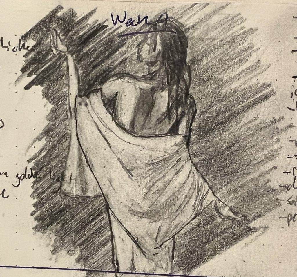
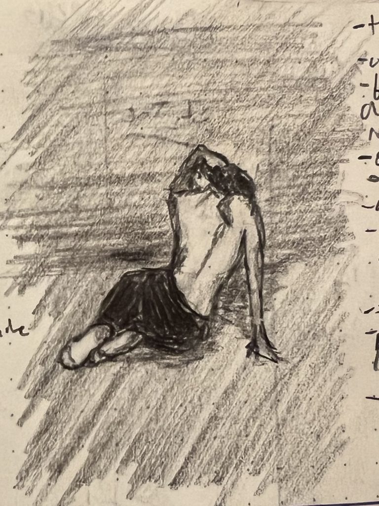
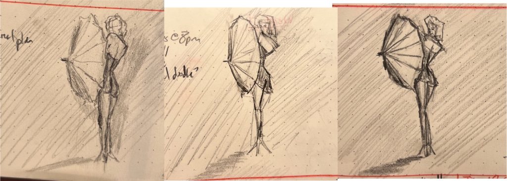
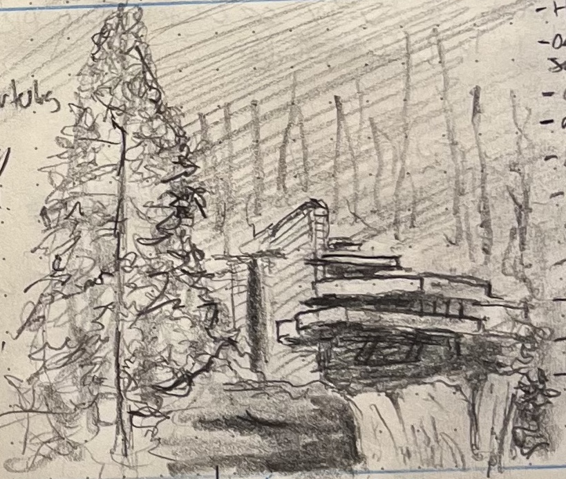
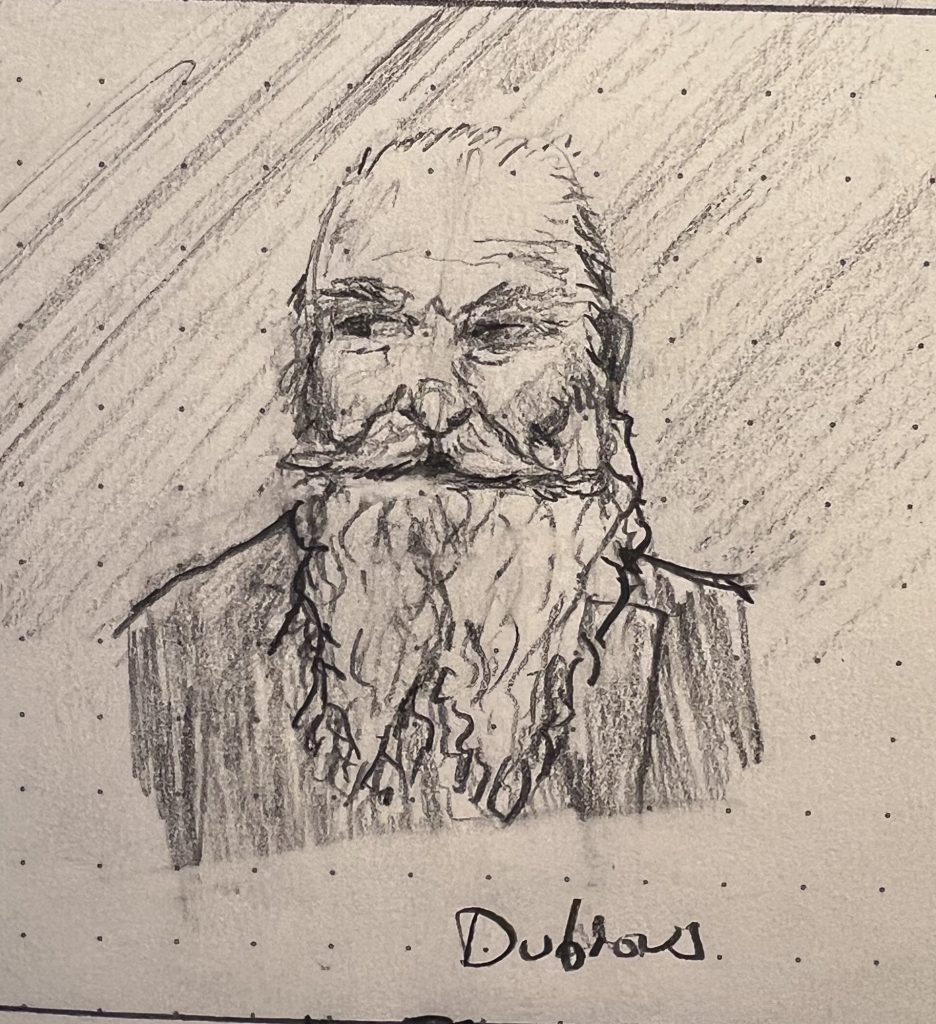
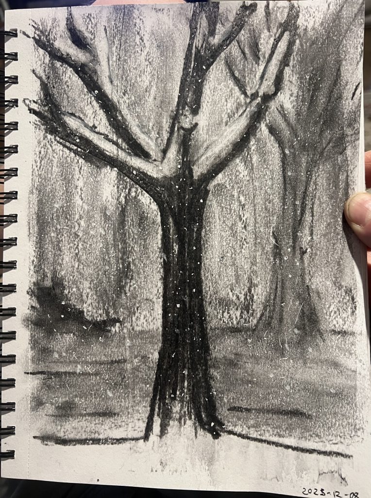
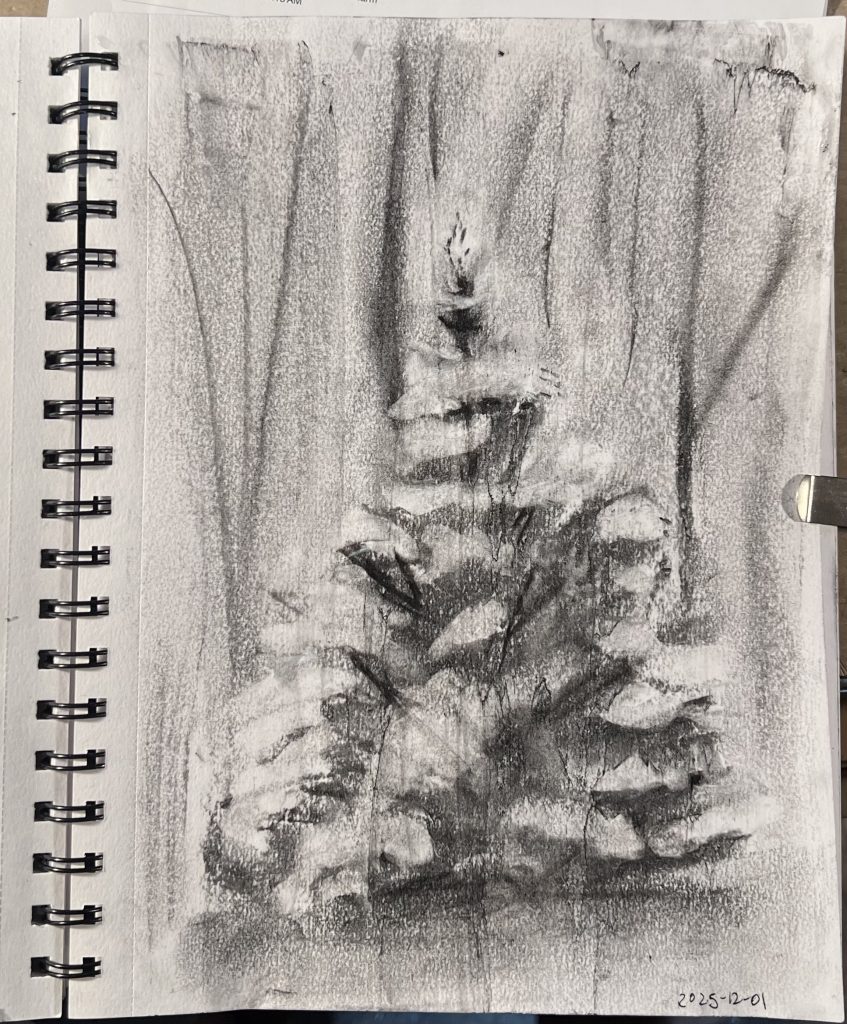
My wife and kids all preferred the first of these two sketches, while I felt the second was clearly better. This isn’t the first time we’ve disagreed about sketches, but it was the first time that none of us could intelligibly articulate why we were so certain of our position. Each just felt that it was totally self-evident which sketch was better, and trying to defend that was like trying to defend why blue is blue.
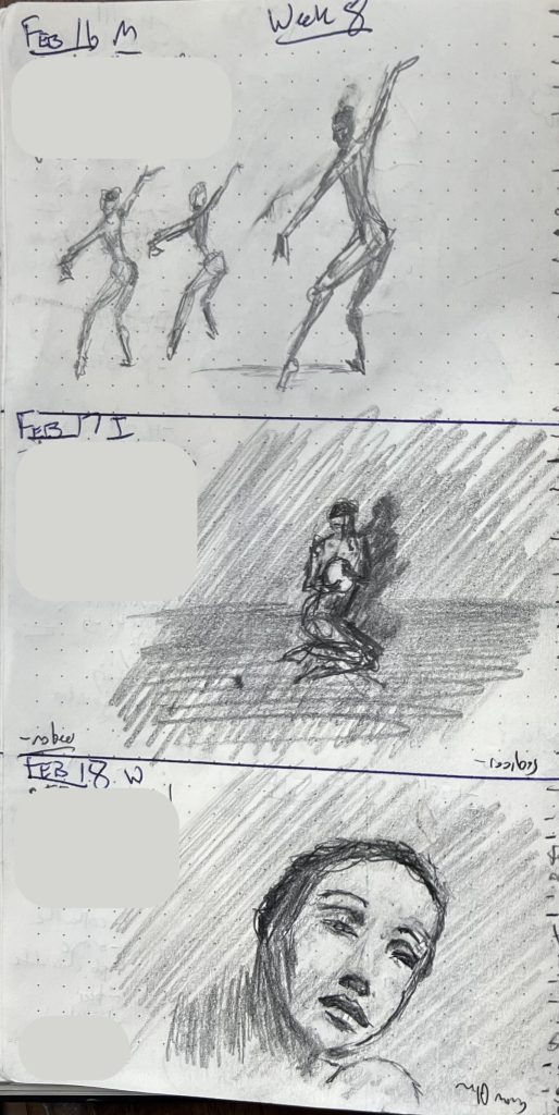
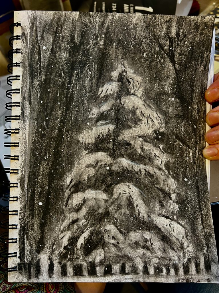
Matters of taste aside, a couple things became clear this week (which was, like last week, entirely dedicated to working with the new-to-me technique of laying down a light layer of graphite to start, so that I can draw in dark values with my pencil and “draw” in light values and highlights with my eraser):
- Work in this way makes it much easier to drape cloth in a naturalistic way
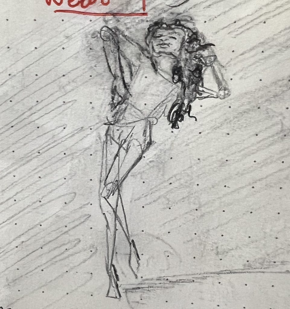
- Backs are hard for the same reason noses are hard: they are nominal regions defined by how we categorizing things in our head, not starkly delimited regions defined by hard lines (contrast: the eye, a beard, a profile, etc.) I.e., backs are another prime candidate for “draw with the eraser” approaches.
- It is intensely satisfying to start a drawing break by just laying in a nice smooth medium layer of graphite. Recommended.