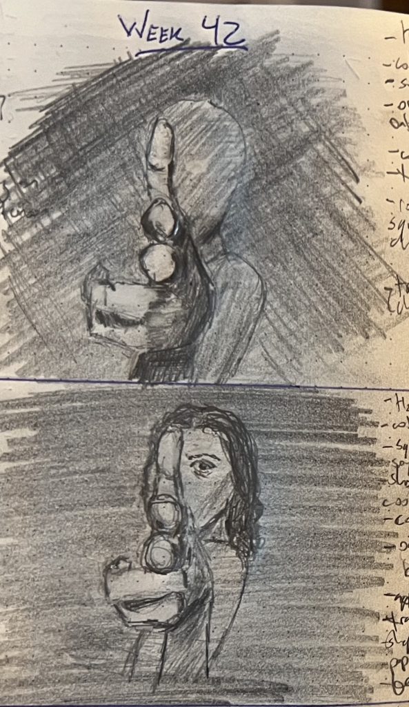
Extreme foreshortening is a really important compositional tool—it brings hella drama with little effort. It’s also hella mindbending: getting that sketch remotely right requires getting your brain to disregard all of the stuff it knows (A FIST IS WAAAAAY SMALLER THAN A HEAD!@!!!!1!!!!😱) and just let the hand make the pencil scratch out what the eye sees. It’s fun, once you get past tearing your hair out.
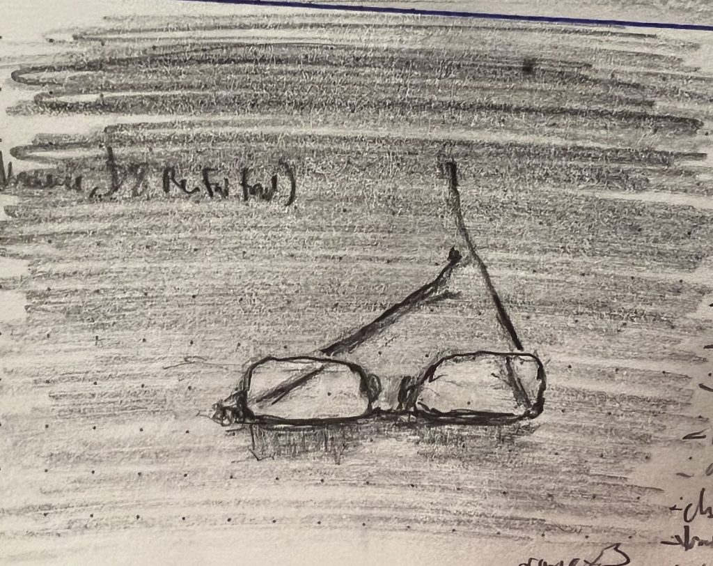
I’ve spent the last week and some change trying to sketch individual rocks. My son pointed out that rocks are arbitrary shapes, so you can’t lean nearly so hard into the viewer’s inborn pattern recognition; sketching a rock takes you back to a very basic place of making a lot of exhausting and unsatisfactory decisions about which lines and values and volumes are needed to communicate “rock”—all of which makes going back to something man-made or highly defined (like glasses) feel like a vacation, despite the collection of curves and angles and refractions that had previously bedeviled you.
Hence why I spent two weeks drawing rocks, and you are getting my glasses instead.
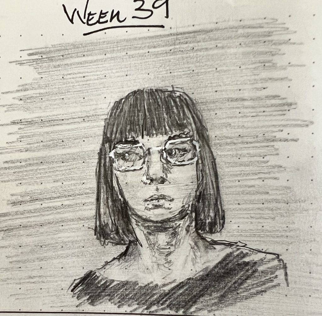
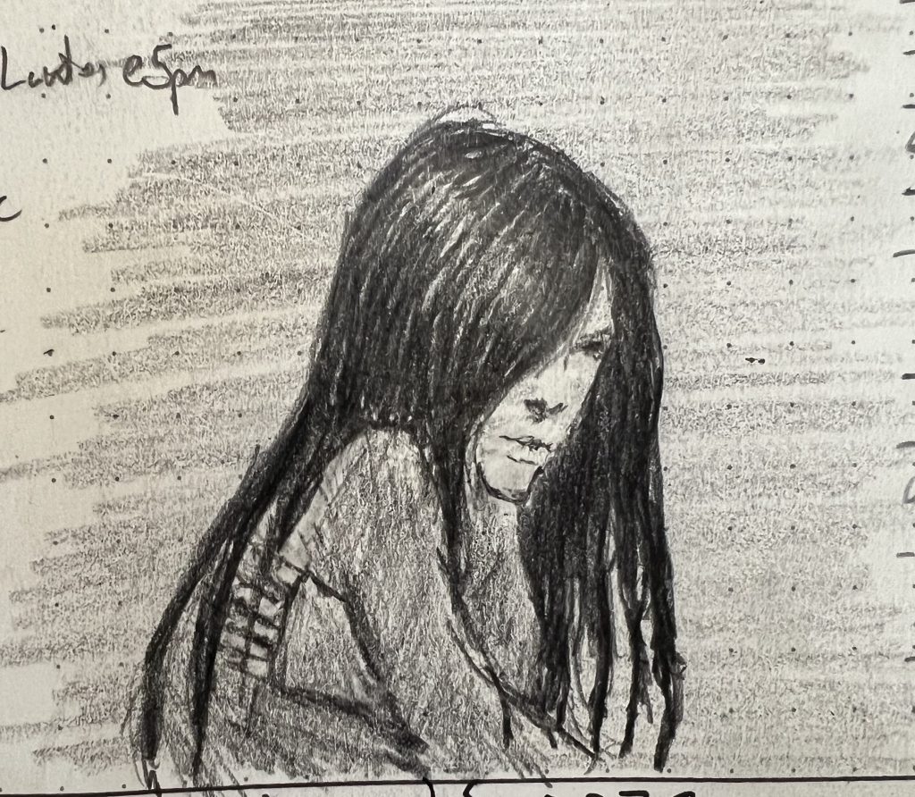
This week was Hair Week. My family preferred the Friday sketch (on the right above)—and they’re right, it was the best hair of the week—but I sorta liked Monday best overall (on the left). It got her expression and vibe right. Also, the glasses were fun. I hadn’t recalled that this was actually my third hair week in the last twelve months. Nice to have the chance to look back and see that, if nothing else, I’ve gotten better at capturing value and volume, not just line.
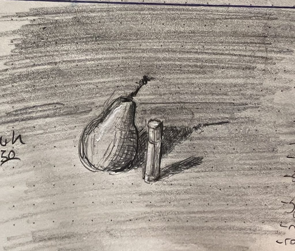
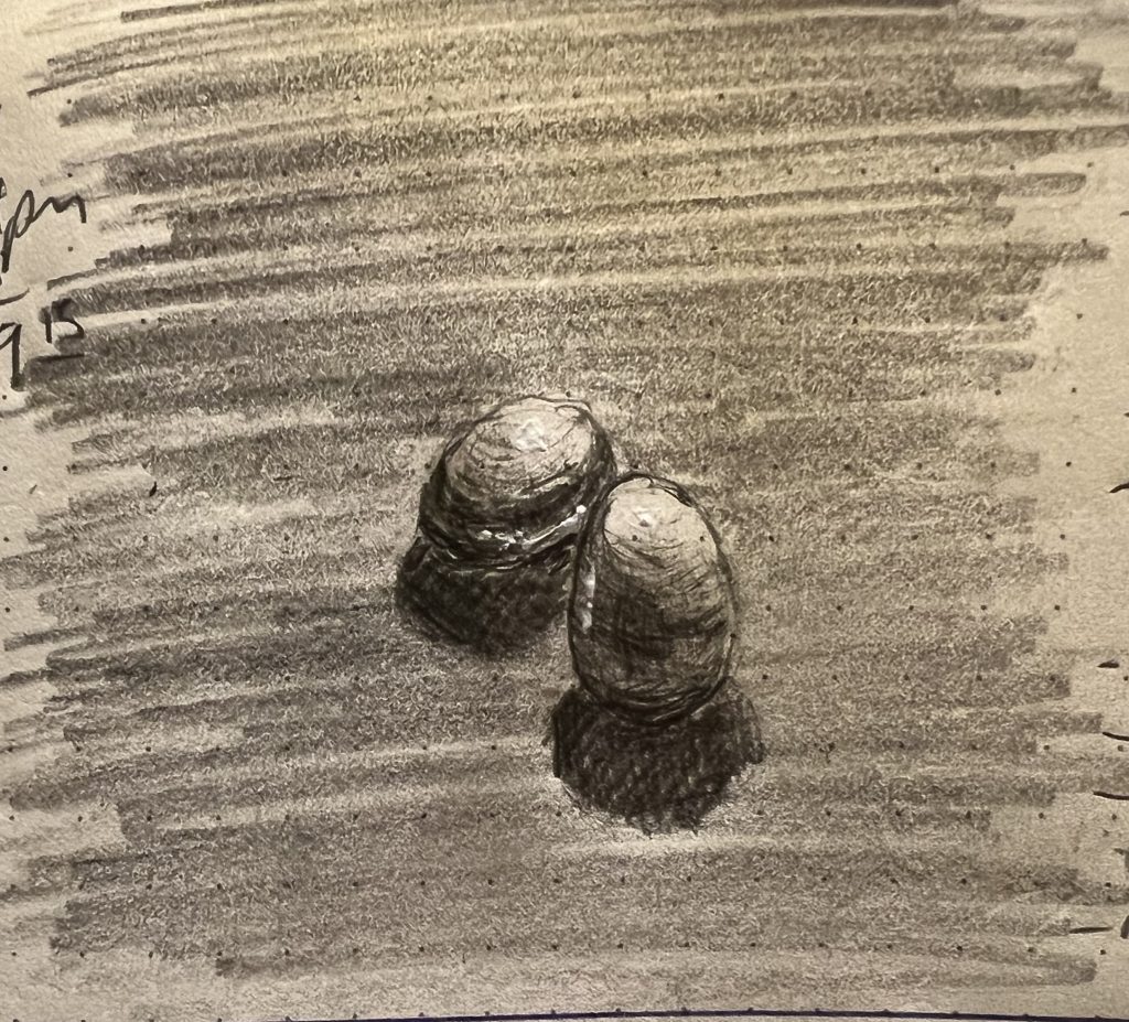
Still lives were an almost inevitable progression after Fruit Week, I suppose. It was nice to move more toward ideal forms, and also juxtaposing the geometrically regular with the aggressively organic (Still Life Week also corresponded with me finishing off the last of the feral pears we swiped from the middle school garden).
My son preferred the two eggs sketch (he found the whole week “very poetic,” but this one spoke to him most. I preferred the lip balm and pear, which really felt more like a portrait of marriage than a still life.
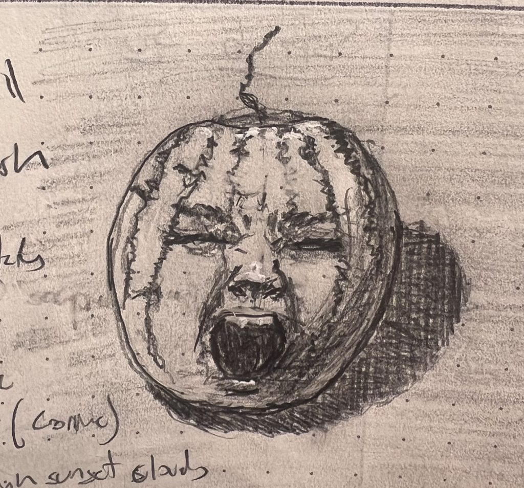
“Fruit Faces” was my follow up to Pear Week. Again, there is a lot to be said for “volunteer,” garden, and farmer’s market fruit as reference models; they have much more character than what’s on display at a civilized grocery store.
‘course, now I desperately want to hear a mash-up of Julie London’s version of “Watermelon Man” and basically anything from Rage Against the Machine. Is there an AI 🤖✨ that can poop that out for me real quick? Or perhaps do one of you fancy folks have a musical inclination toward such perversion? If so, please send your artistic jipes and musical tomfoollery to dave@davideriknelson.com
I spent all of last week sketching pears, because we had a lot of them (we raided the garden my wife looks after all summer), and because pears that have grown without the benefit of culling and fertilizer and pesticide and proper cultivation are endearing and personable little guys.
After several fruitless weeks of driving myself mad experimenting with cross-hatching in India ink, I took a break last week to go back to portraits. It was a huge relief to go back to something I’m used to botching, as opposed to botching new things that you’d erroneously thought would be easy-peasy.
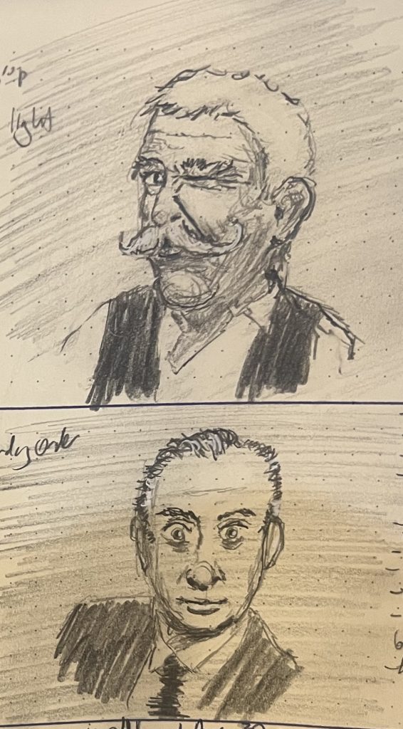
For Week 35 I focused exclusively on “Big Crazy Energy” reference photos. My son loved Mr. Mustacheollio (top, #duh), but I was sorta taken with the final sketch of the week (bottom), which you may be shocked to learn was based on an old black-and-white photo of a young Rodney Dangerfield.
All week I got terrible likenesses, but felt like I captured the energy—and sorta realized that although I’d feel more competent if I could get a decent likeness that folks would look at and say “Hey! That’s Whoever-You-Were-Actually-Trying-to-Sketch!”, it’s the energy that I’m really after. Maybe it’s better to get the energy right anyway. I mean, no matter you hard you try and how good you get, this will never be a pipe, right?
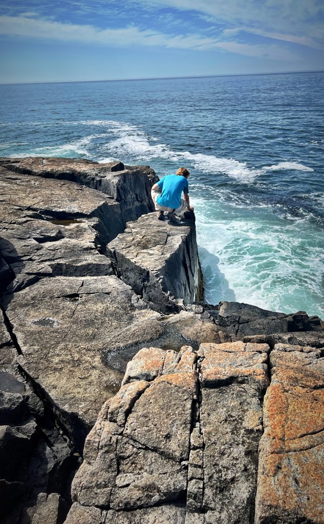
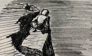
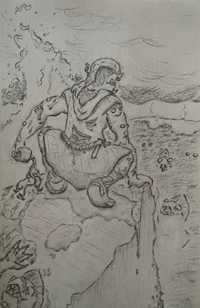
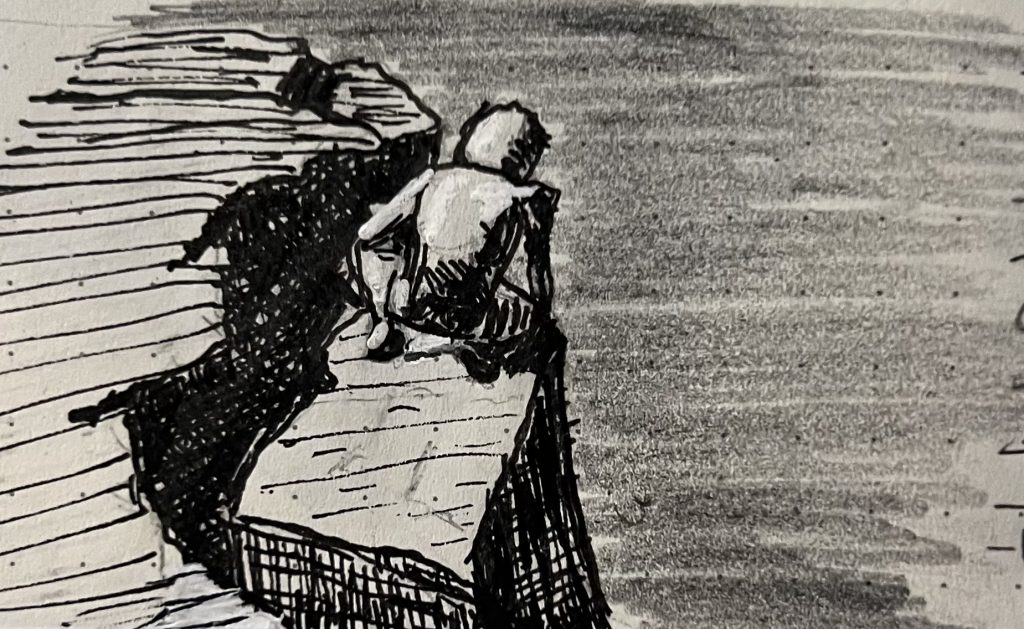
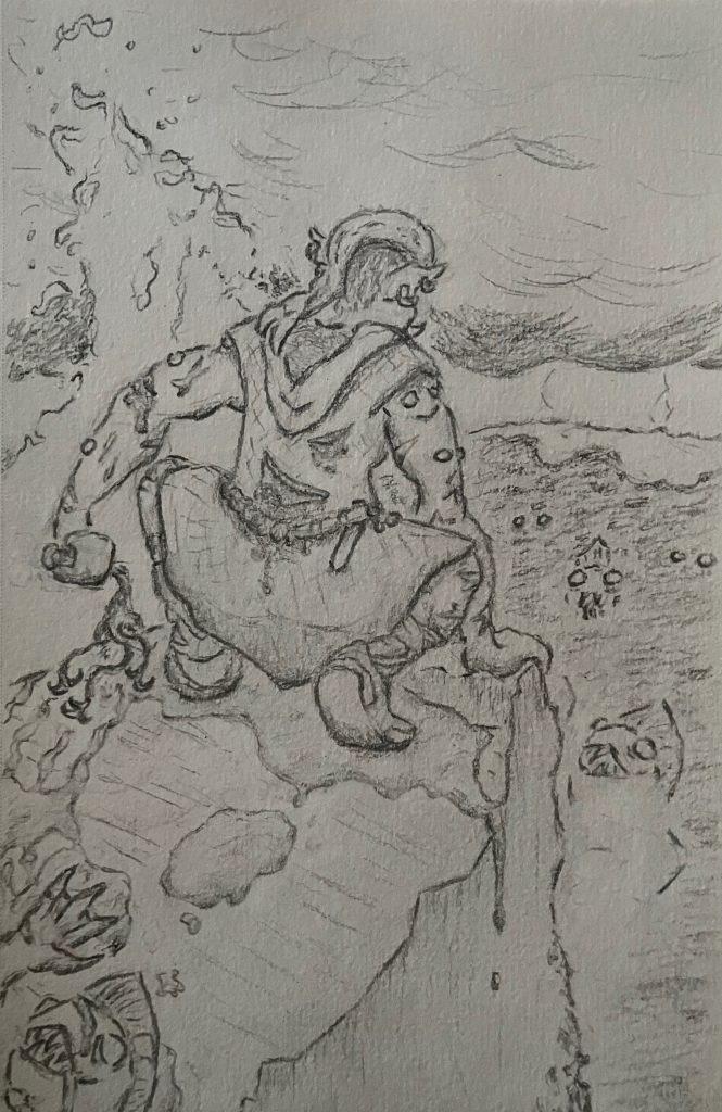
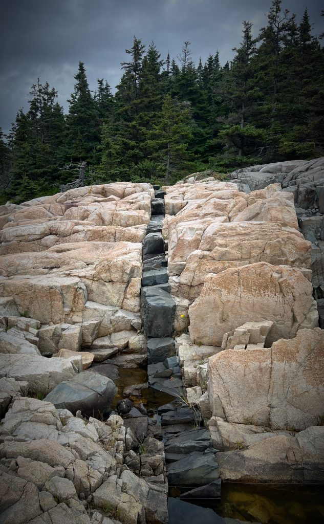
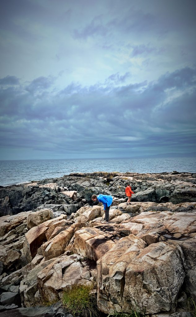
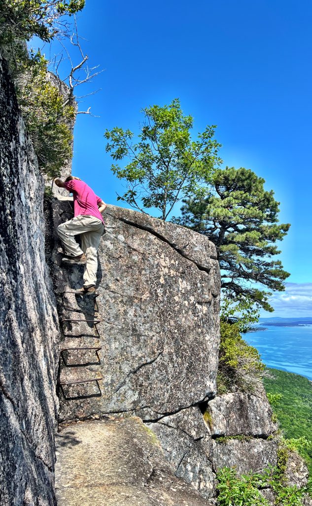
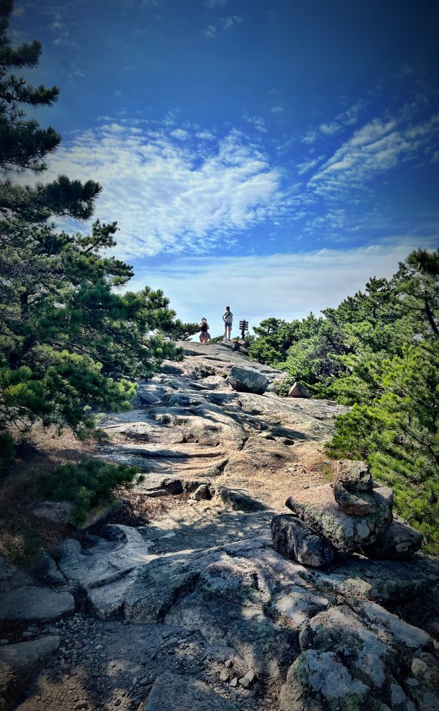
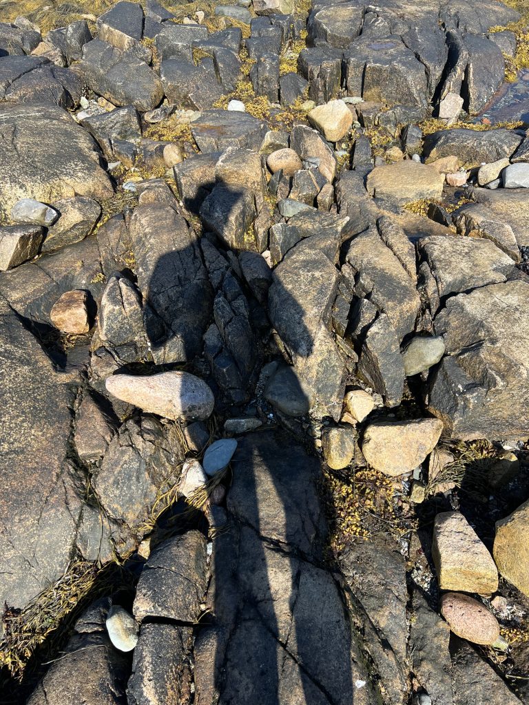
My wife and kids and I spent last week camping and hiking in Acadia National Park, where I snapped the above pic. My son and I both ended up using it as a reference for different drawings. My sketch is the first shown below, his drawing the second.
I guess what really struck me was how closely we both captured the posture and framing, despite working entirely independently and in different media with different techniques. I know that shouldn’t be surprising—we were working from the exact same reference image—but somehow it was.
Anyway, he headed back to college yesterday, and I’m missing him this morning.
If you ever want to visit Acadia, a word of advice: the park is cut into several pieces. The most famous one is right next to Bar Harbor. The hiking is very nice, but the driving and parking and single sand beach (and Bar Harbor itself) are all sorta nuts crowded. The other major chunk is on the Schoodic Peninsula. That’s just a few miles across the bay, but an +1hr drive. The campgrounds over there are quiet and absurdly dark and misty and austerely beautiful. It was lobster season, and on the advice of the border guard (we came in via Quebec), you can get a lobster roll at the grocery store for $9.99 (a summertime Maine staple that will put you back $25 in Bar Harbor).
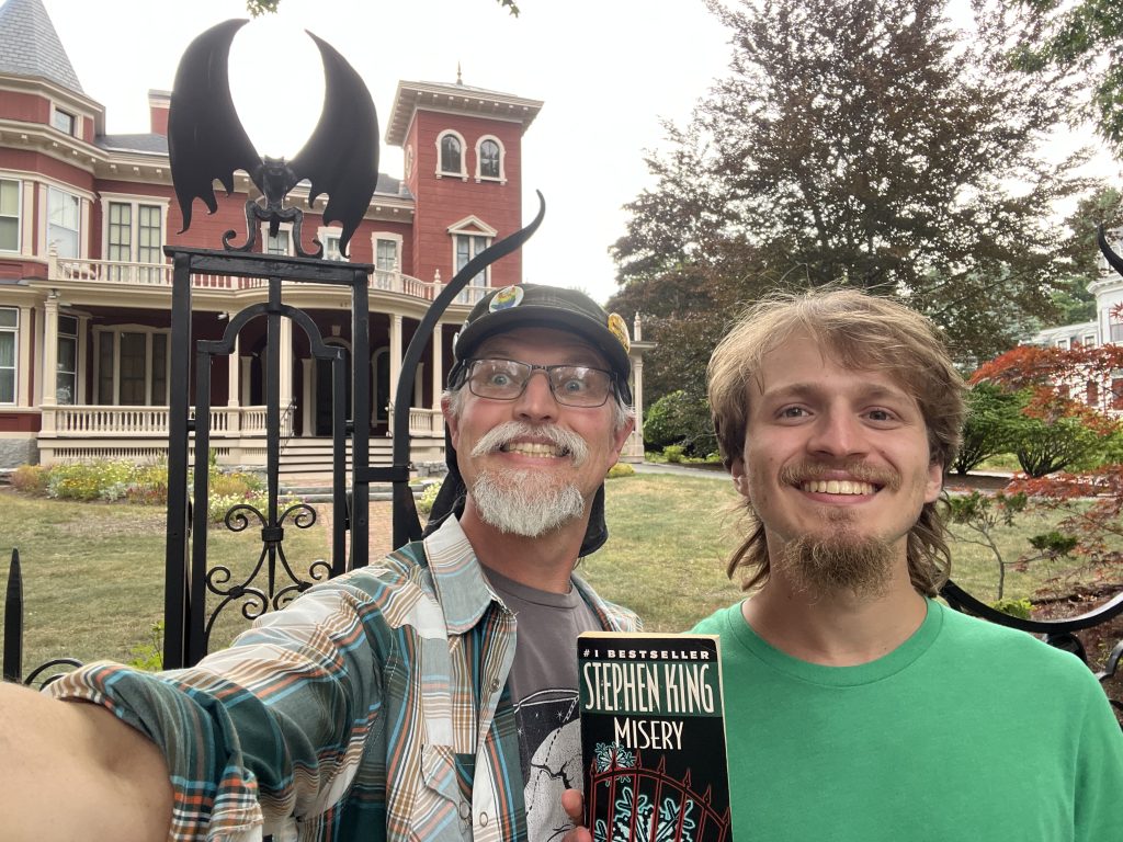
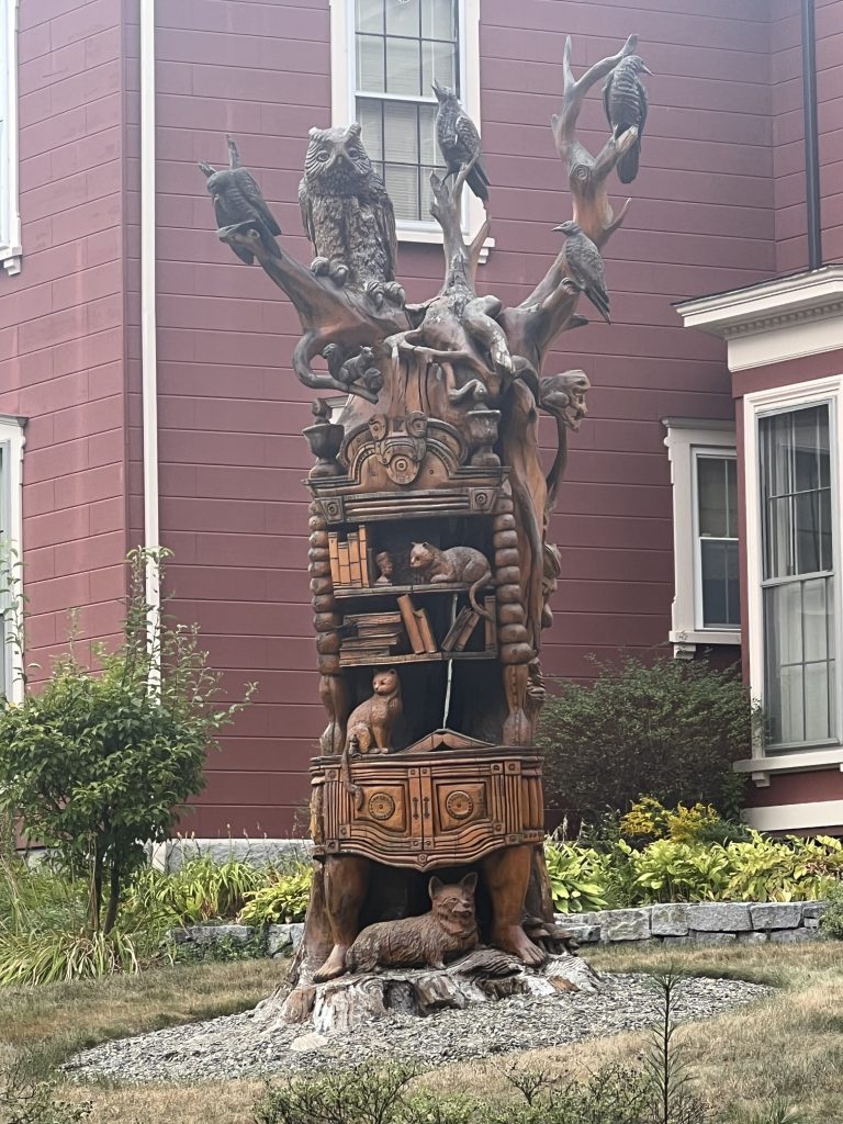
On the way to Acadia you’ll pass through Bangor, where Stephen King’s longtime home still stands:
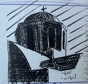
Last week I took my first tentative stabs at learning to crosshatch. PRO TIP: a fude pen is not the place to start. This week I’m taking another stab at it, but using a 0.3 fine liner. Already happier with the results.
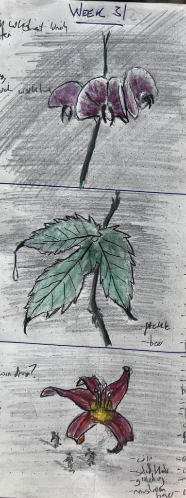
The title sorta says it all: much like the last couple weeks of clownification were about sketching portraits and then clownifying them, this was sketching plants and then emphasizing how damn threatening many plants look.
I’m not gonna say I’m super happy with any of these—my journal paper is a god-awful medium for watercolor, among other issues—but it was nice to go back to experimenting with other media after several years focused almost exclusively on sketching in pencil with a little ink thrown in.
Also, I like the vibe with the lily at the bottom. A lily is a hella scary flower, when you really give it a good look.