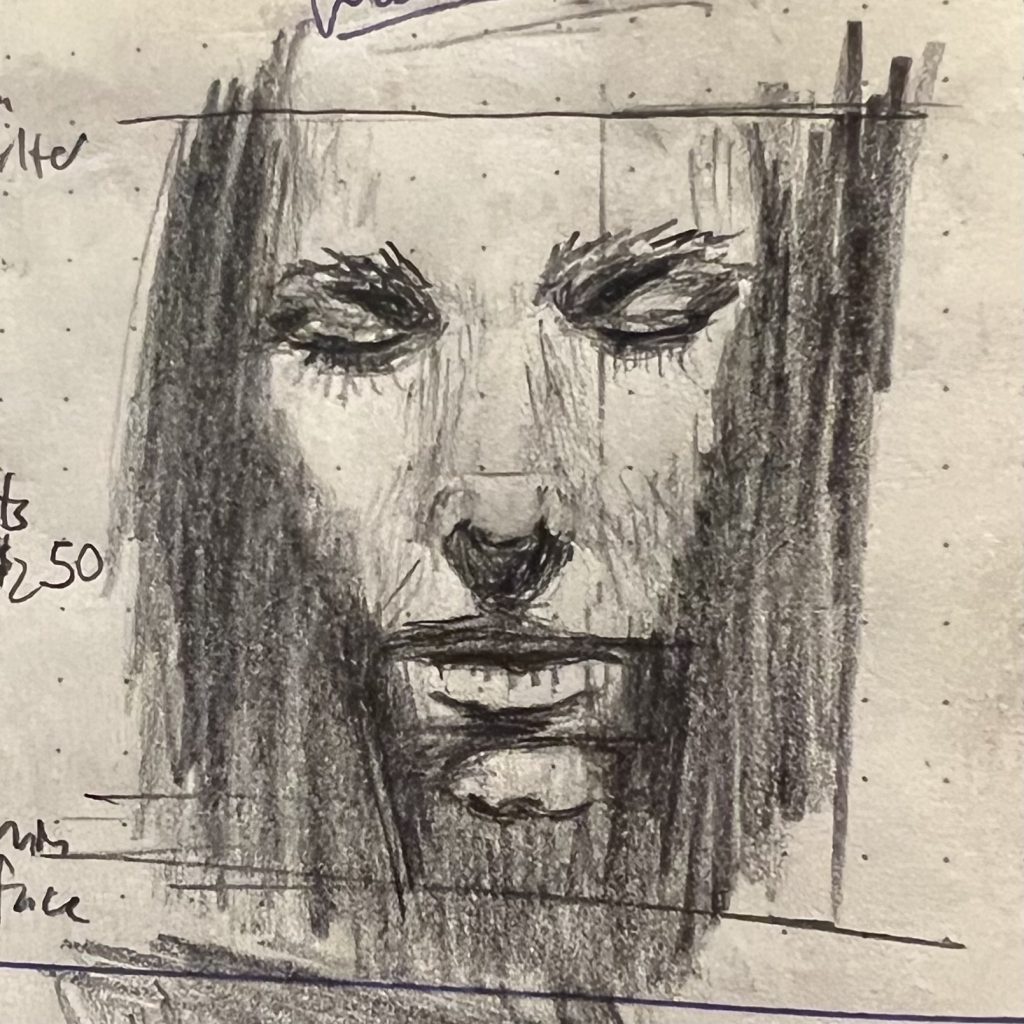
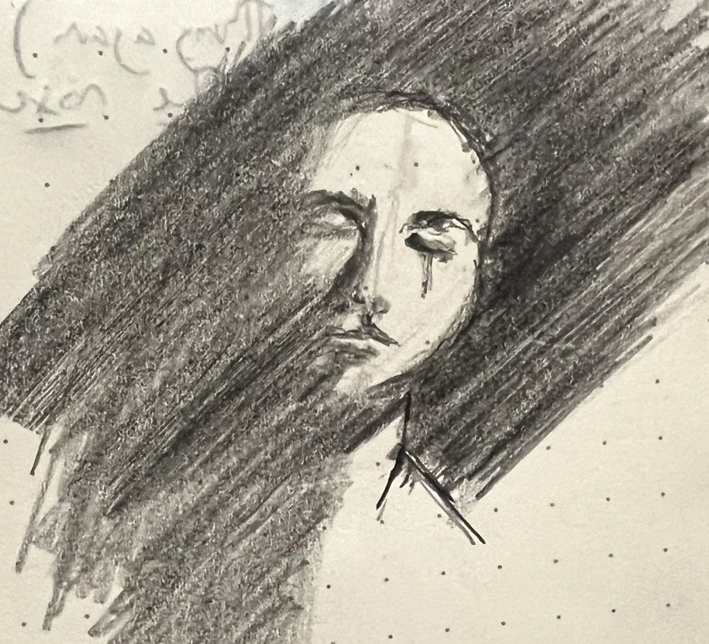
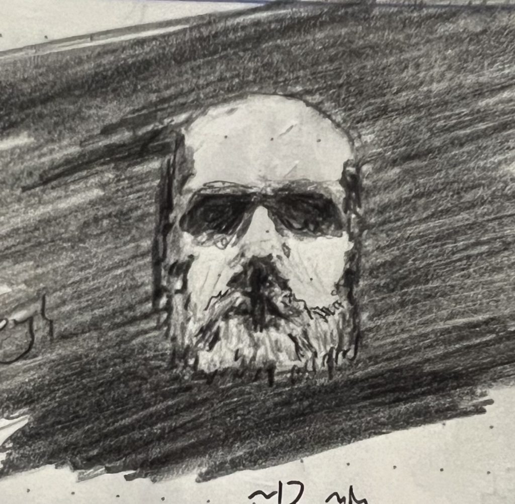
Last week was “parts of faces” week in my journal. I was fairly pleased with all of them, but this schnozzola stood out:
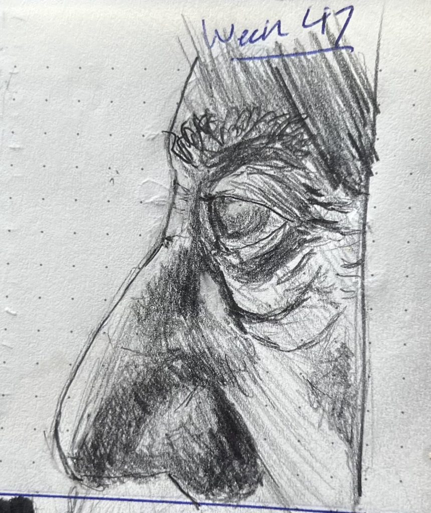
Noses are hard. Mostly that’s because of a lack of hard lines (see my late 2024 complaint that “there is no such thing as a ‘nose’“). But even in profile—the one position where the nose does have a hard definitive outline—it’s still really hard. It’s a damned odd shape, unique to each individual. It grabs an inordinate amount of our visual attention, and we’re extremely sensitive to the intricacies of that shape. It’s like Tolstoy’s Anna Karenina never said: “All eyes are alike; each nose is unhappy in its own way.”
Anyway, I think this is the first nose I’ve ever gotten right.