“Highway Gothic” is the informal name of the sans-serif typeface you see on American road signs:
It’s formally known as the Standard Alphabets For Traffic Control Devices or the FHWA Series fonts. It was originally designed just after WWII, and optimized over time for legibility at a distance while traveling at high speeds.
I sorta love Highway Gothic. In part, that’s because I sort of love basic, sturdy industrial design; I’m the one guy who sorta loves the low-rent Brutalism of poured-concrete parking structures. But a big part of my love of that arises from the unintentional aesthetics that arise, for example, from the decay of that concrete smoothing to nubby rubble and rebar, or the way you can often see the grain of the plywood forms used to pour those Brutalist slabs.
Which brings us to why I have an especially tender spot for Highway Gothic:
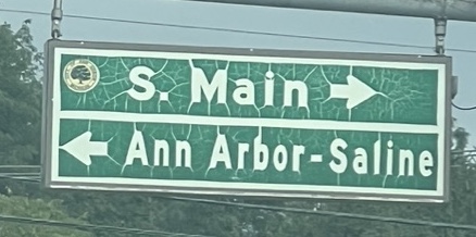
I live in Michigan, where harsh weather and a poorly funded road maintenance program conspire to create an organically emergent “Eldritch Serif” variant of this sans-serif typeface. Here are a few choice examples from around town, where nature chose to add spidery tails and flourishes where man had specifically shaved them away, giving the letters subtle little horns and roots. The remind me of the tagin—little decorative flourishes or “crowns”—added to Hebrew letters in sacred texts, and signs of unrevealed truths; they are letters that are written, but we don’t yet know how to read.
We put up street signs; enthalpy and entropy add further signs of unrevealed truths buried in them. It takes brutal corners and straight lines, and grows roots and branches and tentacles from them.
The “Eldritch serif” variant of Highway Gothic is sort of my favorite thing, especially in the cold and gloom of Michigan winter.
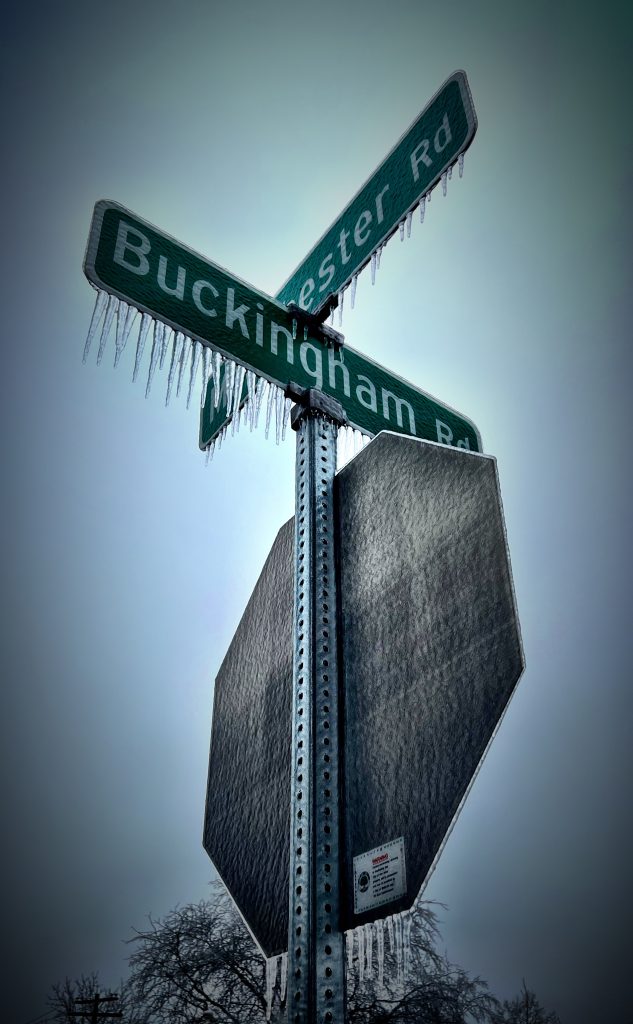
This is an especially gnarly one: