I’ve been thinking more and more about shade and tone and value, and how much more important to form these are than line is. I have pretty crummy distance vision, so just taking off my glass is a quick reminder: most of the time, I mostly cannot see lines at any meaningful distance. Instead, my brain intuits form by assessing tonal values.
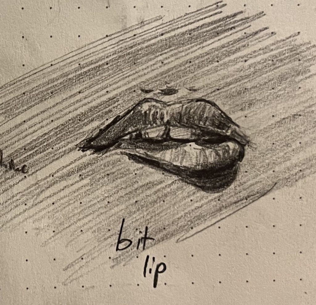
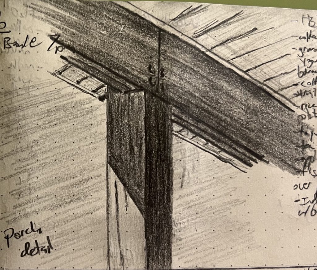
So, the big project right now is turning that whole processing system off in my head, so the hand can just draw the layers of darkness the eye sees, without the stupid brain telling me what’s round and where a corner comes together at 90 degrees. Yeah, that lip is round in real life, but it is flat on paper and just grading from deep black to untouched; that beam’s corner where it meats the joist is 90º on my porch, but is waaaaaay closer to 140º on the paper; the same shadow is way darker on the interior face of the beam than it is on the side.
Anyway, my son opined that “Bit Lip” was the best sketch of the week, so I’m posting that here:
But I think I was more pleased with “Porch Detail”; I’ve struggled mightily to “unsee” 90º angles in architecture, and I think I finally got there on this sketch.
That said, my boy is right: the lips are a more compelling picture overall, even if technically rougher.
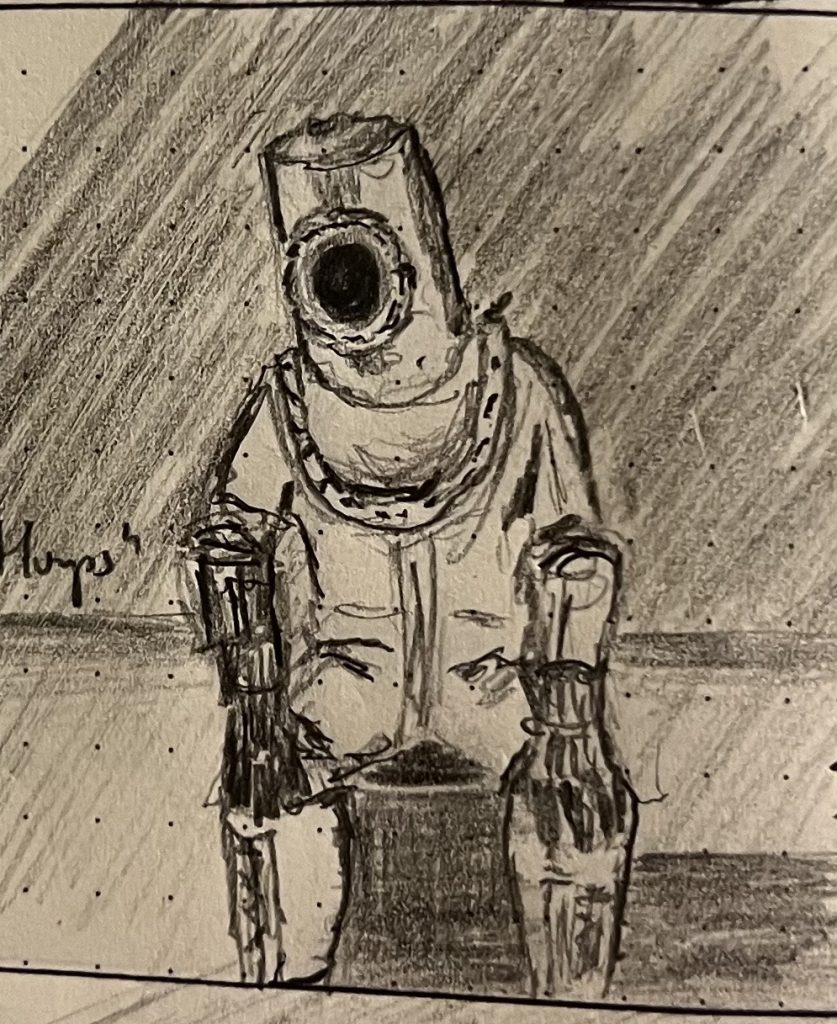
Meanwhile, I’m tossing this guy in as a bonus, because he’s proven sort of a mystery: it’s a failed sketch, to me, totally missing what I was trying to capture, and pretty technically sloppy. But everyone who glances him in my journal asks about him. There’s something about him that is speaking to people along a wavelength I cannot detect. 🤷♀️