Happy Friday the 13th!

Happy Friday the 13th!
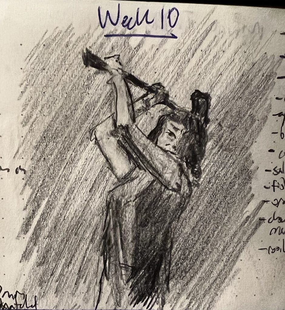
My wife and kids all preferred the first of these two sketches, while I felt the second was clearly better. This isn’t the first time we’ve disagreed about sketches, but it was the first time that none of us could intelligibly articulate why we were so certain of our position. Each just felt that it was totally self-evident which sketch was better, and trying to defend that was like trying to defend why blue is blue.
Matters of taste aside, a couple things became clear this week (which was, like last week, entirely dedicated to working with the new-to-me technique of laying down a light layer of graphite to start, so that I can draw in dark values with my pencil and “draw” in light values and highlights with my eraser):
I’ve been drawing for the last month, just not posting, because I’ve been really busy, and not really happy with many of my sketches.
In the middle of last week it dawned on me that instead of just layering up graphite on blank paper, I could start a sketch by laying down a more-or-less uniform mid-tone of graphite over the entire area. Then I’d be able to draw in darker darks in the shadows, and draw in brighter highlights with the eraser. 💡🤦♀️ (I am besought by extremely obvious revelations. Ask me how old I was when I first realized that the “Little piggie that went to market” wasn’t, like, wandering the aisles of a grocery store pushing a cart.)
Anyway, the end result are sketches with a dynamic range of tonal values I’m much happier with, where I work faster and find the work much more soothing overall.
My son’s pick for the week was the bottom sketch. He liked the lips.
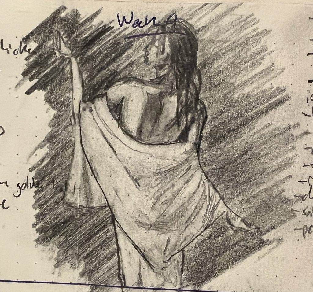
Week 4 for is pinups again—where less is more, both in terms of clothes on bodies and lines on page.
My son said this first one was the most “human and dynamic.” I picked it because it was the most arresting: I was fairly confident you’d stop and look and click. At the very least, it epitomizes something that feels really central to the pinup aesthetic, about the power and confidence of the women depicted in these pieces. They may be nude, but are not naked.
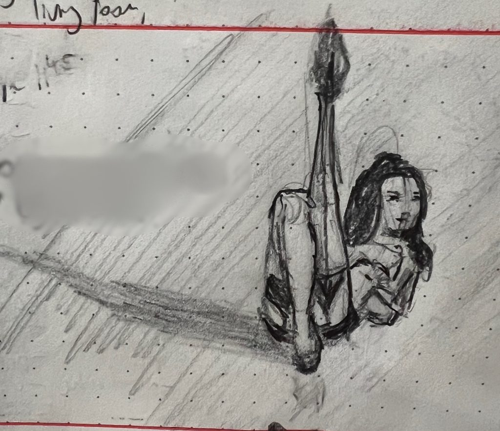
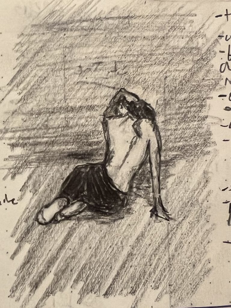
That said, I think I was probably happiest with this sketch, which was maybe the most “poetic” for lack of a better word. It captures something about being lost in the luxuriance of moving through space that I really liked.
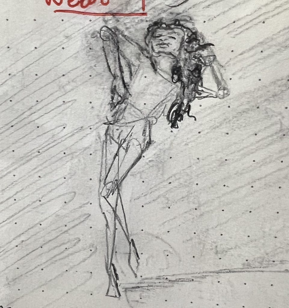
…Now hear me out:
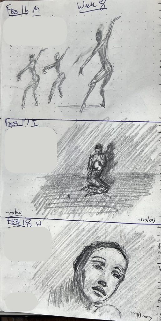
It dawned on my last week that there is an interesting geometric regularity among images that you glance at and immediately categorize as “pinups.” More often than not, the women can be quickly visually approximated with a handful of mostly acute triangles, like so:
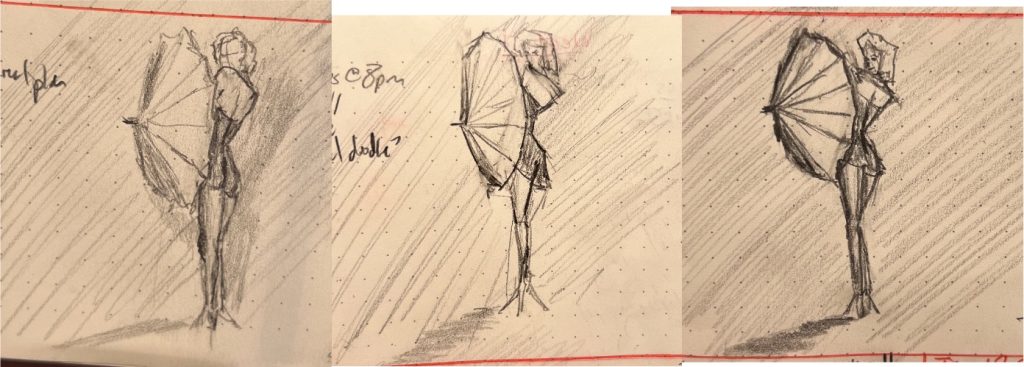
These are presented in the order I drew them over several days—the reference was an old Marilyn Monroe pinup I found on Pinterest. My son thought the one furthest to the left was the best one, because it really properly capture that coolly appraising over-the-shoulder glance (even with no eyes). I feel like I was still making her torso waaaaaay too long (a chronic problem I have sketching full-body gestures). The sketch furthest to the right is the best overall, even if it’s the least like the reference. I included the middle because, despite its flaws, it captured the “geometricness” of the pose that had caught my attention to begin with.
A couple week’s back we visited Frank Lloyd Wright’s Fallingwater, a really lovely building that perfectly illustrates why you probably shouldn’t build a poured-concrete modernist gem over an active river in a region of the country that has multiple freeze-thaw cycles each year. Here is the current state of the house (we were there on the absolute final day before they close for six months of renovations/restorations):
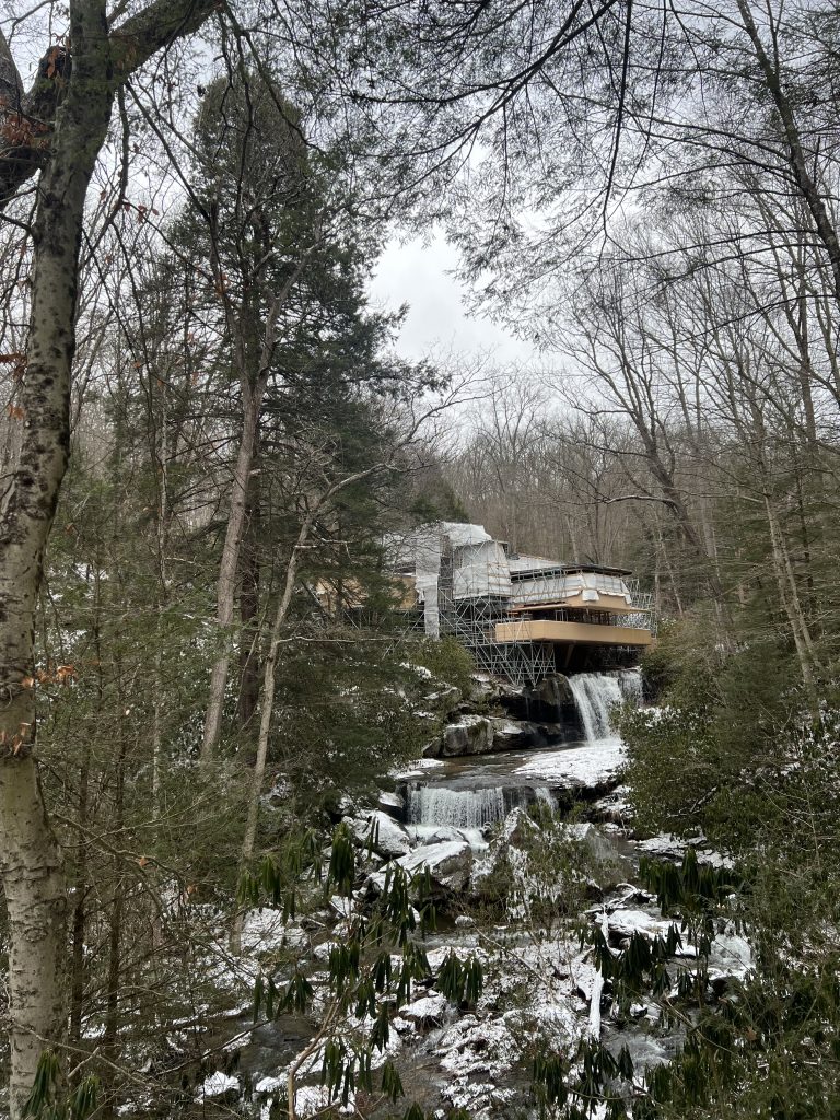
So, on the one hand, a bummer to go to an architectural gem and not be able to see it. On the other, I really loved seeing Fallingwater in situ in person (context: my father was trained as an architect, my mother as a painter and lithographer; I grew up with a lot of art and in a lot of museums and a lot of opinions about architecture and design and construction ad nauseam). I especially loved the tension between this balanced, monumental, (in)famous building and this towering unnamed pine tree.
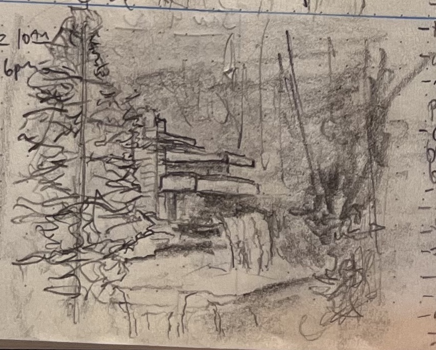
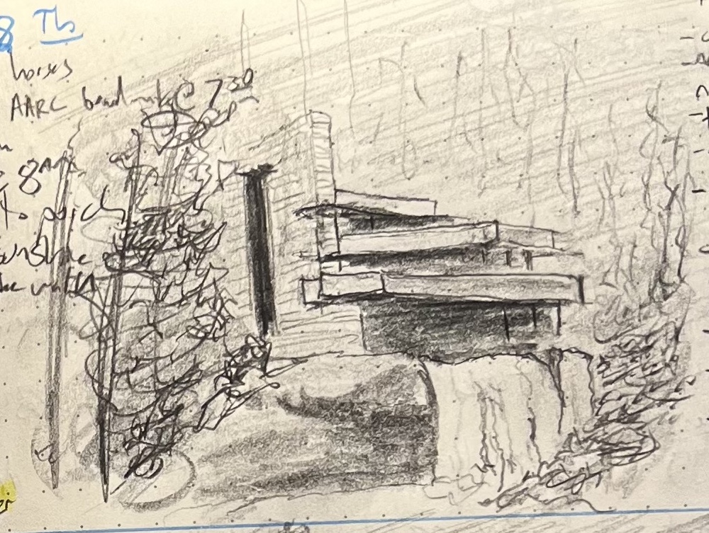
I spent the next week drawing it, compositing my photo and several existing professional shots of the building, so I could have untented Fallingwater in its place among the trees, scaled as I saw it at the end of December 2025. The results were five sketches: Fallingwater (i–v). My wife and kids were divided and which attempt came out best.
My son insisted it was Fallingwater (iii) (he couldn’t say why, but I think it’s because he was standing with me when I took the above pic, and liked how this sketch captures both cataracts and the pool between):
I preferred (iv), because it felt like I got the depth on the rocky outcropping right, and there was some stuff with line weight that worked out:
And my wife and daughter chose (v), with my daughter specifically liking that you could glimpse the windows and underpinning structure better:
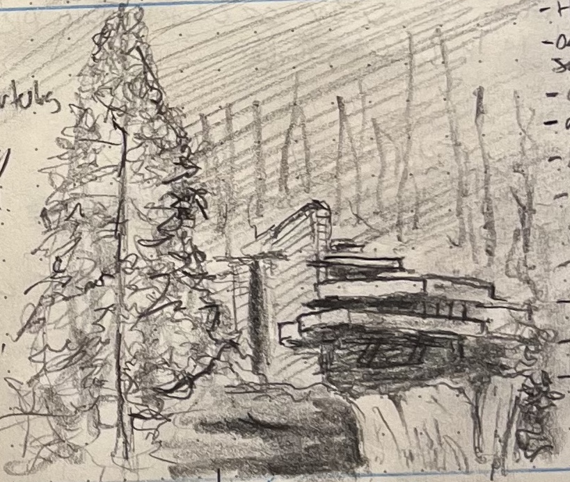
In retrospect, I agree with my wife and daughter: Fallingwater (v) is best, but mostly because it makes the tree and the building equal protagonists in the scene. Also, the rocky outcropping is pretty good.
I spent the tail end of 2025 trying to bridge the gap between sketching and portraiture—little of which I shared, because every inch of progress uncovered miles and miles of deficit. Get a lip right, and realize you have no idea how to communicate the junction of nose and eyes; get the features right, and you realize you’re clueless on how to capture hair. Maybe you nail the expression and hair, but ferfucksake your little girl looks like a 50-year-old man!
…and so on.
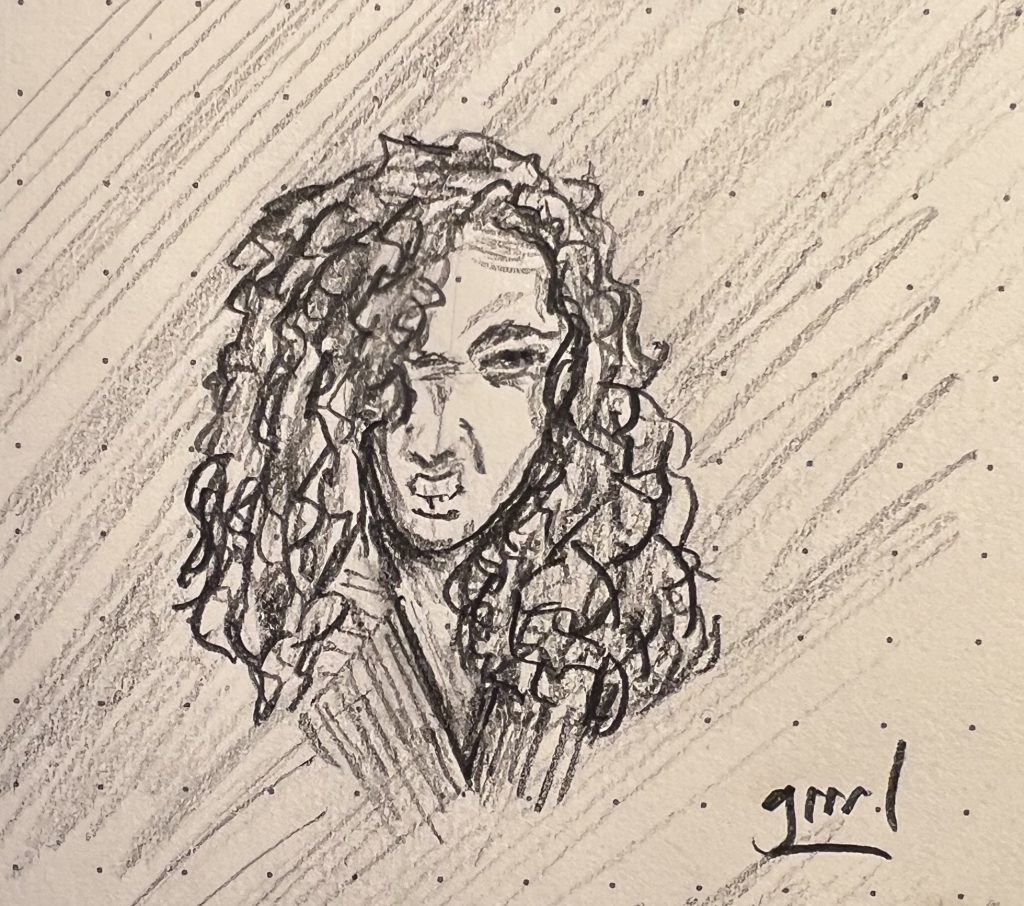
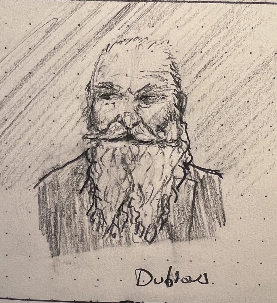
Anyway, here are two sketches from the first week of the year that my son thought came out nicely. I agree that I got what I wanted with the hair with both, and that the tiniest victory is still a victory. 🏆
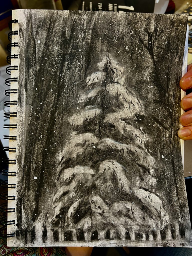
This is the final Sketch of the Week for 2025. It’s a charcoal I did to mail to my nephew, who’s in whatever-comes-after-basic-training for the US Army, down in San Antonio. No snow there, so I’m sending him some of ours.
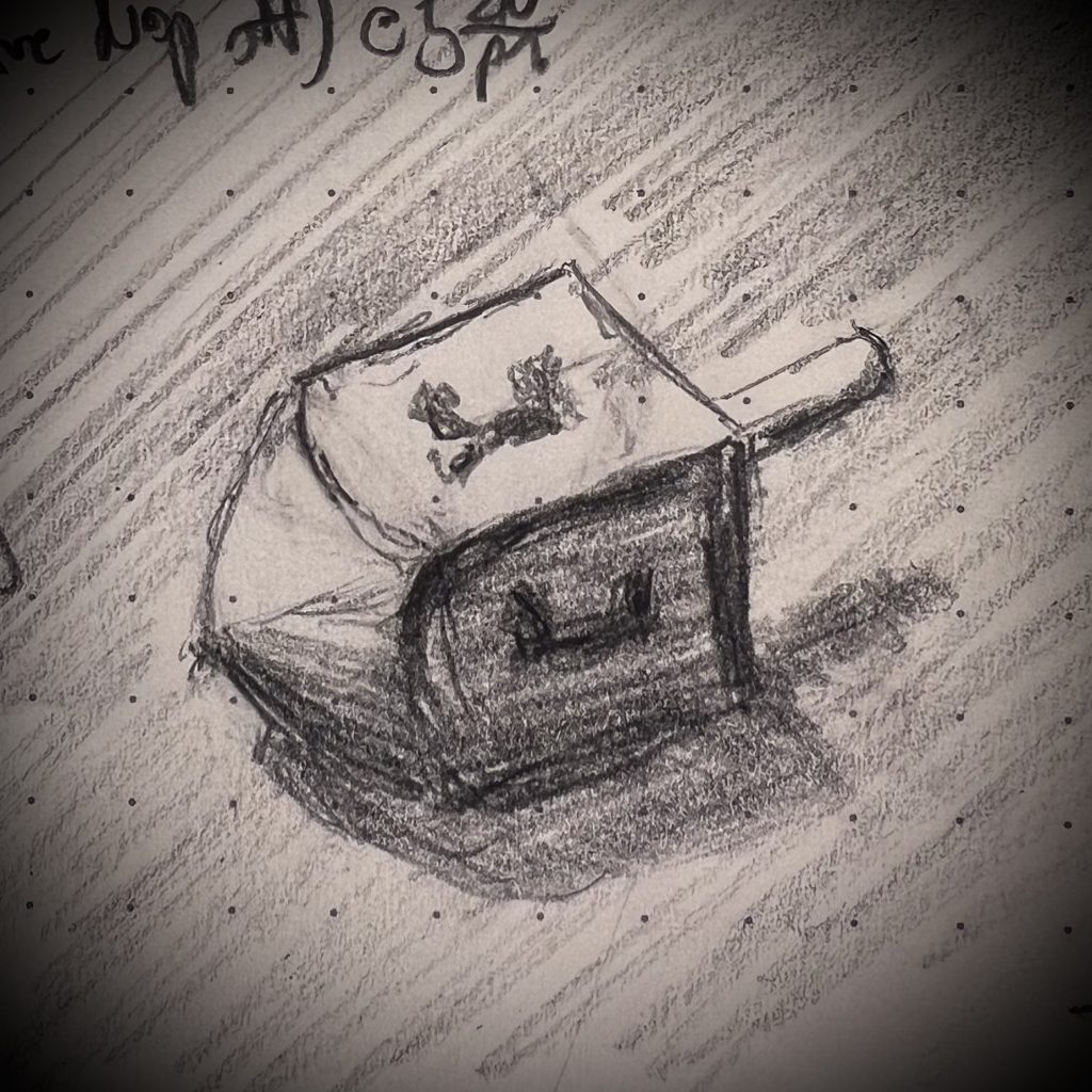
Last week was Chanukah, which means I had dreidels lying around, hence this sketch from life. If anything demonstrates my progress over the last two years of sketching, this is it:
In real life, a dreidel is a roughly rectilinear solid that’s basically a modified cube, each side of which is bears a roughly rectilinear character, inscribed squarely on that face. The whole thing has radial symmetry along a central vertical access (or else it wouldn’t spin).
In a drawing, there isn’t a single 90º, nor a single non-angled line. Drawing it accurately to life means making everything about it wrong on the paper. Two years ago that simple fact made me batshit insane; my stupid eyes saw 90º angles all sorts of places where they were not actually visible, and even when I convinced my eye to see what it saw instead of what it knew, my traitorous hands kept drawing the 90s they knew to be true in life, rather than the 85s and 95s and 142s the eyes could see from where they were sitting.
This time? None of that sturm und drang. I spun a dreidel, I saw a dreidel, it fell, and I drew:
Tonight I’m told is Erev Kristmas. May it be a joyous one to those who observe, and a peaceful Nittel Nacht for the rest of us.
Just frontin’. I fucking know it’s Xmas; I’m a half-a-Jew by birth. I’m just bustin’ your balls.
please don’t hurt us
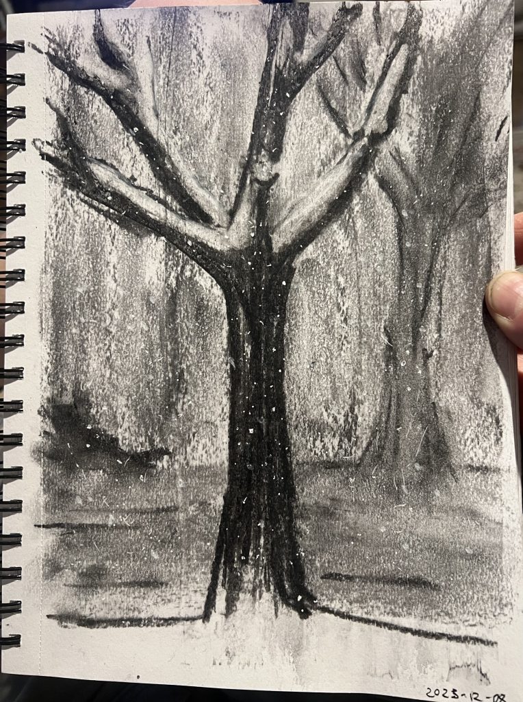
I wasn’t super happy with this one (but much less happy with everything in my journal; I’ve spent the last couple weeks trying to learn to quickly capture facial expressions, and now feel more face-blind than when I began).
My son opined that my dissatisfaction with this charcoal arose from the fact that a deciduous tree has harder lines and holds snow differently than a pine, and thus doesn’t lend itself to the sort of gauzy effect I got in Week 49. I think I maybe just lucked out last week and ended up punching well above my weight. I did like the way further mixing media (adding in white gel pain overtop the Mod Podge that’s overtop the soft charcoal) made the snow pop the way I like.
Anyway, it’s still winter here, so expect further snowy trees in your future.