Less is more and more is everything (Sketch of the Week for Week 4 of 2026)

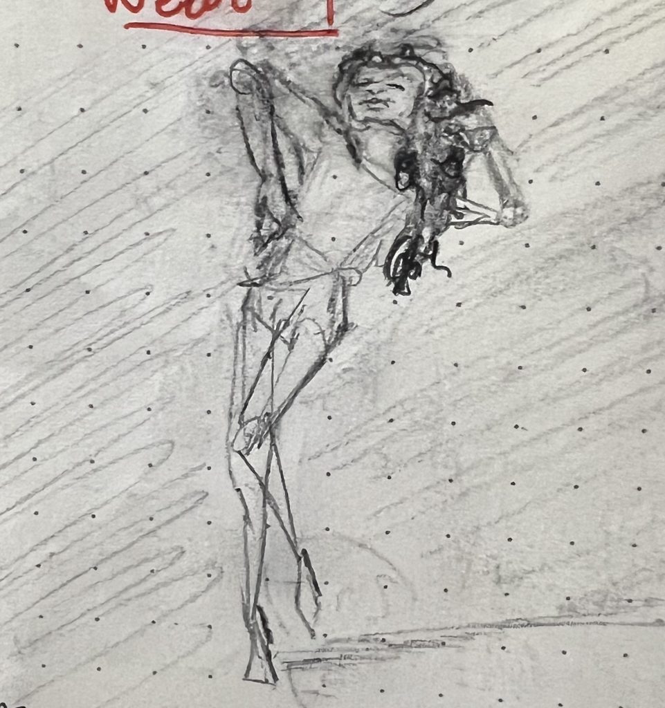
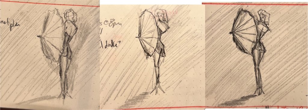
Week 4 for is pinups again—where less is more, both in terms of clothes on bodies and lines on page.

My son said this first one was the most “human and dynamic.” I picked it because it was the most arresting: I was fairly confident you’d stop and look and click. At the very least, it epitomizes something that feels really central to the pinup aesthetic, about the power and confidence of the women depicted in these pieces. They may be nude, but are not naked.

Pencil sketch of a classic pinup. A dark haired woman in stockings and little else reclines on the ground, one leg raised, the other bent demurely, hand draped casually to cover (not hide) her breast.

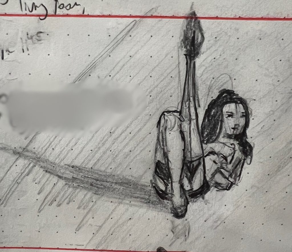
That said, I think I was probably happiest with this sketch, which was maybe the most “poetic” for lack of a better word. It captures something about being lost in the luxuriance of moving through space that I really liked.

Pencil sketch of another pinup. A nude woman dances. In the sketch her body is rendered in quick geometric forms, with only her hair and face revealing notable human detail.

I’m thinking that maybe triangles are inherently sexy…? (Sketches of the Week for Week 3 of 2026)

…Now hear me out:

It dawned on my last week that there is an interesting geometric regularity among images that you glance at and immediately categorize as “pinups.” More often than not, the women can be quickly visually approximated with a handful of mostly acute triangles, like so:

Three fairly geometric pencil sketches of a pinup of Marilyn Monroe in a black bathing suit with an umbrella.

These are presented in the order I drew them over several days—the reference was an old Marilyn Monroe pinup I found on Pinterest. My son thought the one furthest to the left was the best one, because it really properly capture that coolly appraising over-the-shoulder glance (even with no eyes). I feel like I was still making her torso waaaaaay too long (a chronic problem I have sketching full-body gestures). The sketch furthest to the right is the best overall, even if it’s the least like the reference. I included the middle because, despite its flaws, it captured the “geometricness” of the pose that had caught my attention to begin with.