Hard Lines and Dissolution (Sketches of the Week for Week 44 of 2025)

Week 44 was anotherChiaroscuro Faces Week.”

My son characterized several sketches from this week as looking like “ghosts unwillingly dissolving.”

Pencil sketch of a face dissolving into  shadows, caught somewhat closer to agony than ecstasy

Pencil sketch of a face looming out of shadows, caught in something like quite reflection

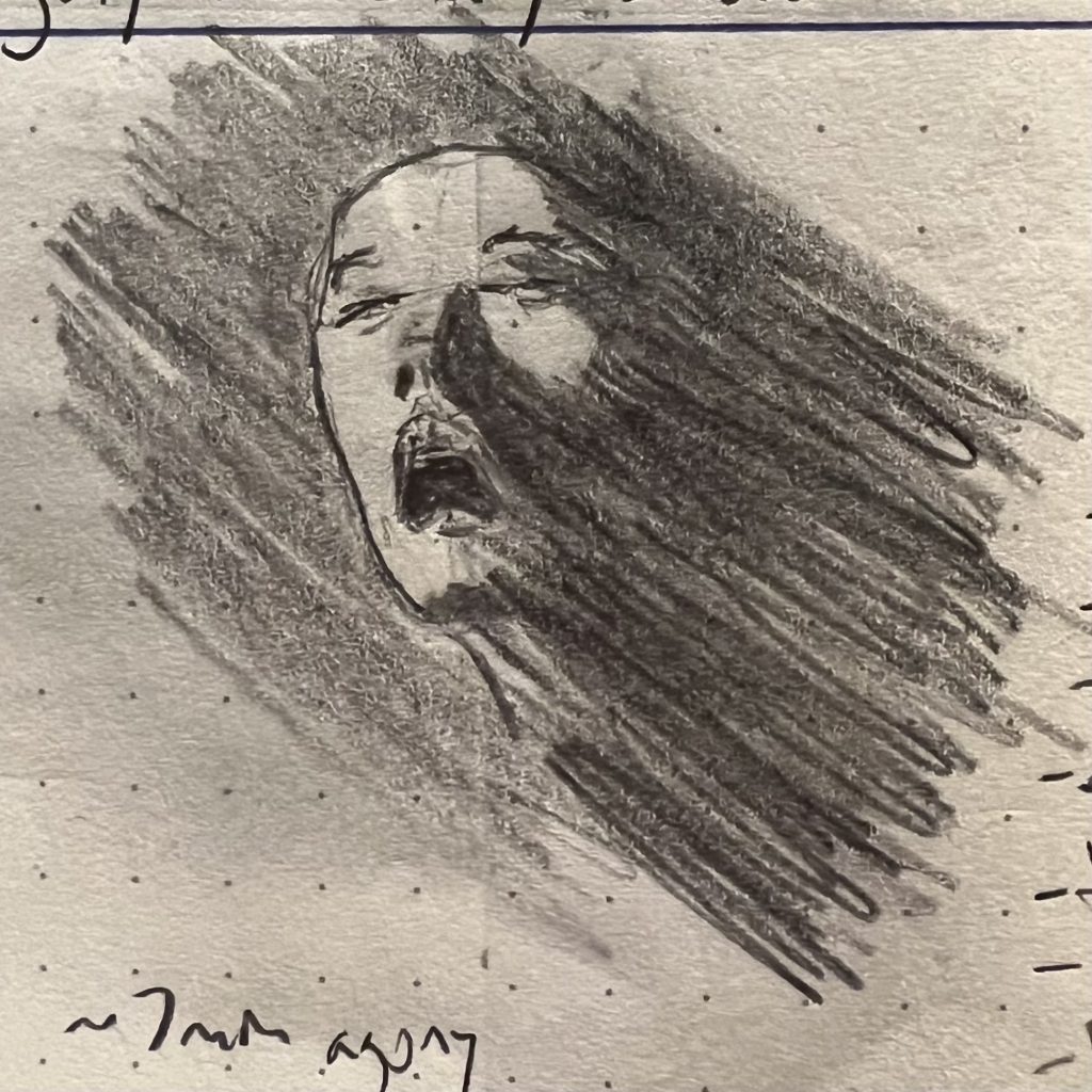
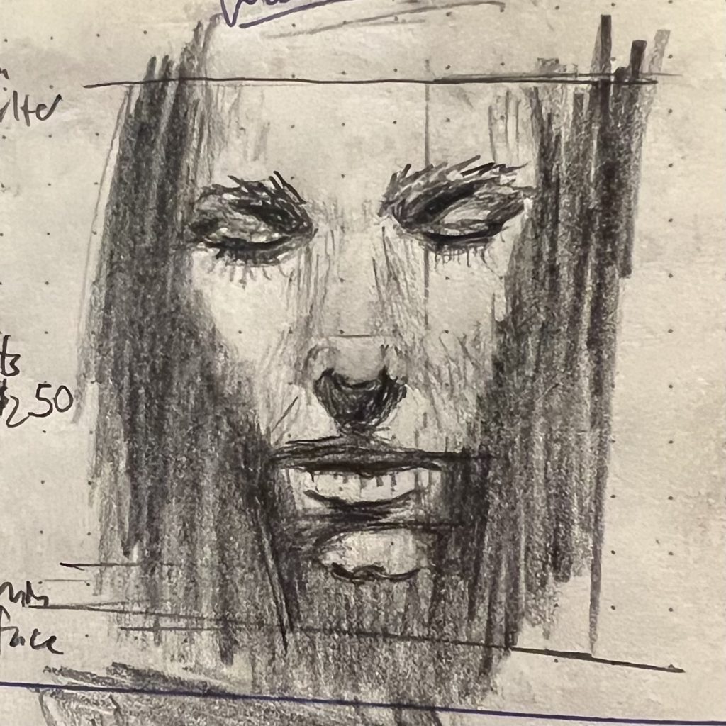
With that second sketch he noted that “the background shadows and the face shadows really look cut from the same cloth. That’s really hard to do but I think you did it there.”

I see what he’s saying, but in this case it was totally unintentional. It was only about a week later that I was clicking through various screenshots of old drawing instructional books I found on Pinterest, and saw a discussion of the problem of hard lines in primarily tonal studies. In both cases it was the use/absence of hard lines that got the effect that made them striking (on the upper sketch the left edge of the face has a hard delineation while the right is allowed to “dissolve”; on the lower the face is framed entirely in shadow, with no precise hard outline).

I wouldn’t have put all that together without his feedback. For my part, I just liked the emotions that wound up on the page.

“Don’t hand me no lines and keep your hands to yourself” ♬♫♪ (Sketches of the Week for Week 24 of 2025)

This was another split decision sketch week. I was actually mostly happy with every sketch this week (which is extremely rare) but also felt that each of them had unresolved issues, either with legibility or just minor composition decisions early in the sketch that ended up creating headaches.

At any rate, my son felt that these two were the best showing.

A loose pencil sketch of two hands looming out of the gloom
A pencil sketch of a saucy warrior

He really liked how the hands loomed out of the gloom, and the overall gesture in the second sketch. I really liked working on the first (the extremely foreshortened hands were both challenging but super engaging to work on) and the second is, as discussed in the past, an indisputable crowd-pleaser (saucy powerful ladies garner second glances and clicks—although, that aside, capturing the depth of the way she is sitting and the angled and occluded way the axe-hand-arm interact was really pleasingly challenging).

Final note: For ladies and gent of a certain age, the title of this post will trigger a potentially catastrophic earworm. To the rest of you, I offer a mostly forgotten one-hit wonder of my Cold War youth, the presumably ironically (???) named Georgia Satellites.

Sketch of the Week: Sunset, Skyline, Power Lines (Oct 18, 2024)

This week’s sketch is watercolors and India ink, of a house up the street after the sun has dipped below the treeline, but is still above the horizon:

A watercolor painting depicting a silhouette of a house and power lines against a vibrant sunset sky. The sky features shades of red, orange, and yellow, with trees partly framing the scene.

Back when I was a teen I was taught two ways to use India ink: dip pen and bamboo calligraphy brush. You can do a lot with either, but Jesus are they fiddly. Also, the old bottle of India ink I have is not waterproof, which is great for certain effects, but often maddening overall (esp. against watercolor).

So this was done with Faber-Castell Pitt pens, which are amaaaaazing. Yeah, a dip pen can give you a much finer line, and an ink brush can do really interesting dry-brush and textural things that you can’t coax out of a Pitt pen. But in terms of bang-for-buck (esp. when the “buck” translates to hair-pulling frustration), the Pitt pen is hard to beat:

The India ink is dark and flat and deep, water soluble/flowable when first applied, but then dries absolutely waterproof. They have a ton of different nibs. For this sketch I used a 0.3 fine liner and a soft-brush (the later nicely emulates doing wet-brush work with a Japanese calligraphy brush, giving you all the expressiveness and none of the sorrow). The color of the sky was me experimenting with wet-on-wet watercolor.