Flex and the Water Bottle (Sketches of the Week for Week 23 of 2025)

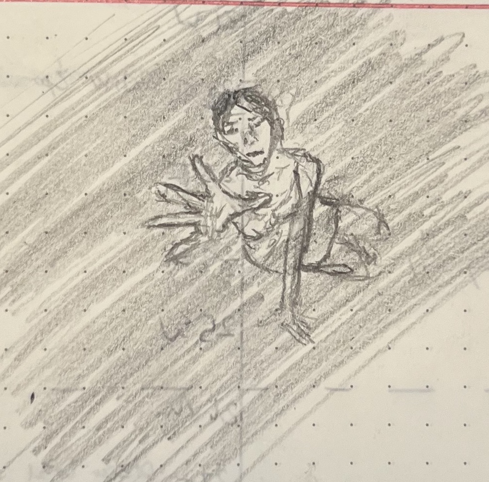
This was another week of sketches more about shading and volume than form. My son slightly preferred this first sketch (the model was wearing crazy long-fingered claw-gloves):

A pencil sketch of a scantily clad woman with long frond-like claw fingers

But he also really liked this water bottle sketch:

A pencil sketch of a steel water bottle, its shadow reaching toward the viewer

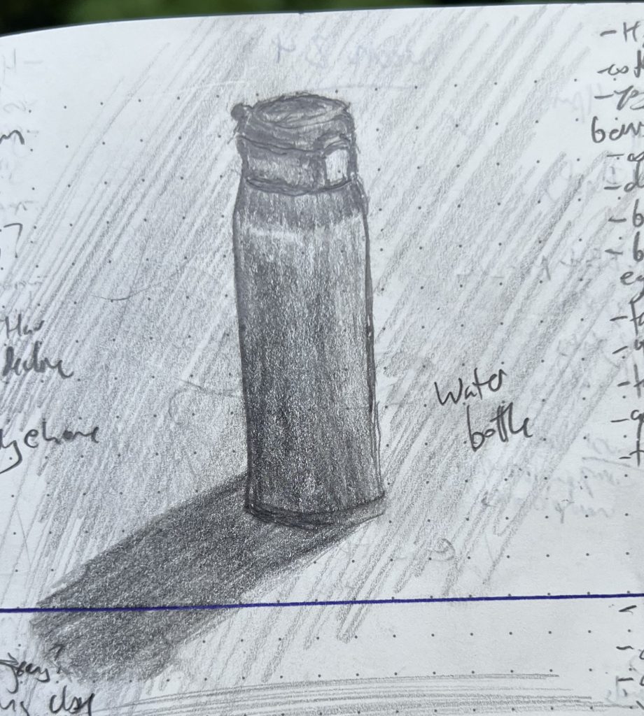
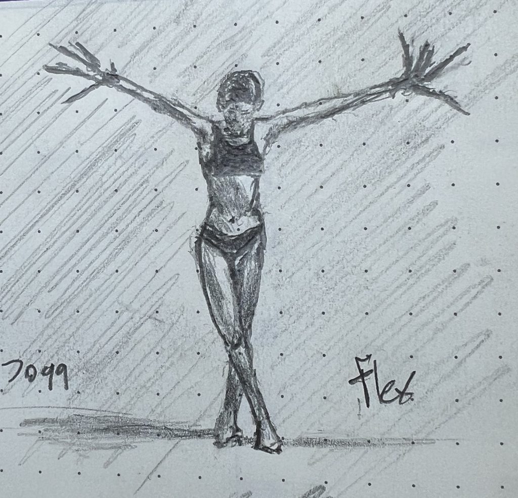
I recognize that the top sketch is more compelling (scantily clad women in powerful poses are a crowd-pleaser!) but the bottle was a bigger victory. The “Flex” sketch was from a two-dimensional image on my phone; I sketch that way a lot, and have gotten accustomed to translating two dimensions of pixels into two dimensions of graphite on wood pulp. The water bottle was just sitting on the table IRL. When you are sharing actual real space and time with an object, it’s much harder to fight the brain’s need to tell stories about what the “actual” shapes are, and instead let the eye tell the hand what it sees where.

Throwing shade (Sketches of the Week for Week 19 of 2025)

I’ve been thinking more and more about shade and tone and value, and how much more important to form these are than line is. I have pretty crummy distance vision, so just taking off my glass is a quick reminder: most of the time, I mostly cannot see lines at any meaningful distance. Instead, my brain intuits form by assessing tonal values.

So, the big project right now is turning that whole processing system off in my head, so the hand can just draw the layers of darkness the eye sees, without the stupid brain telling me what’s round and where a corner comes together at 90 degrees. Yeah, that lip is round in real life, but it is flat on paper and just grading from deep black to untouched; that beam’s corner where it meats the joist is 90º on my porch, but is waaaaaay closer to 140º on the paper; the same shadow is way darker on the interior face of the beam than it is on the side.

Anyway, my son opined that “Bit Lip” was the best sketch of the week, so I’m posting that here:

Pencil sketch of a close-up of a woman's mouth; she's biting the corner of her lower lip.

But I think I was more pleased with “Porch Detail”; I’ve struggled mightily to “unsee” 90º angles in architecture, and I think I finally got there on this sketch.

That said, my boy is right: the lips are a more compelling picture overall, even if technically rougher.

Pencil sketch of the detail of a timber supporting beam holding up a joist supporting a section of overhanging porch roof.

Meanwhile, I’m tossing this guy in as a bonus, because he’s proven sort of a mystery: it’s a failed sketch, to me, totally missing what I was trying to capture, and pretty technically sloppy. But everyone who glances him in my journal asks about him. There’s something about him that is speaking to people along a wavelength I cannot detect. 🤷‍♀️

Pencil sketch of a seated man in a full Victorian diving suit

The girls ain’t all right… (Sketch of the Week for Week 18 of 2025)

My son and I once again were of differing opinions. I thought the best sketch from last week was this one:

A pencil sketch of a woman sitting on the floor, defeated, head hung low and hair obscuring her face, hands planted on knees.

He agreed that it was good technique overall, and he liked the gesture. But nonetheless, he thought this one was the best sketch of the week:

A pencil sketch of a woman on the floor, reaching up toward the viewer as that viewer recedes up and away.

I argued that nailing the foreshortening put this over the top, even if it is overall looser and more dashed off. No doubt, foreshortening is devilishly hard: You sort of have to turn off your brain entirely and just let your eye thoughtlessly control your hand to even get remotely close to getting it right. As such, even if the “technique,” broadly speaking, is better in the top sketch, it’s also true that the top sketch is very much an analytical exercise, one where I spent a lot of time layering up graphite in order to make this posture legible at a glance. As such, I didn’t just think about it; I vastly overthought about it, arguing with myself, breaking down what shapes were where and why. Meanwhile, my “technique” was fundamentally stronger with the bottom sketch, in that it was drawn with almost no intellectual engagement or justification or analysis, just my eye guiding my hand, setting down what it saw. Simple recording, without analysis, is at the heart of the exercise.

I dunno. I still feel “Defeat” is the better sketch—or, at least, it captures the current moment better, and that’s what it’s all about.