A week of falling water (Sketches of the Week for Week 2 of 2026) Copy

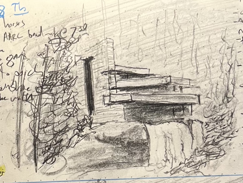
A couple week’s back we visited Frank Lloyd Wright’s Fallingwater, a really lovely building that perfectly illustrates why you probably shouldn’t build a poured-concrete modernist gem over an active river in a region of the country that has multiple freeze-thaw cycles each year. Here is the current state of the house (we were there on the absolute final day before they close for six months of renovations/restorations):

My reference photo of Fallingwater tented for restoration (Dec 2025)

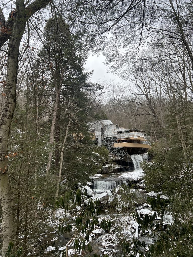
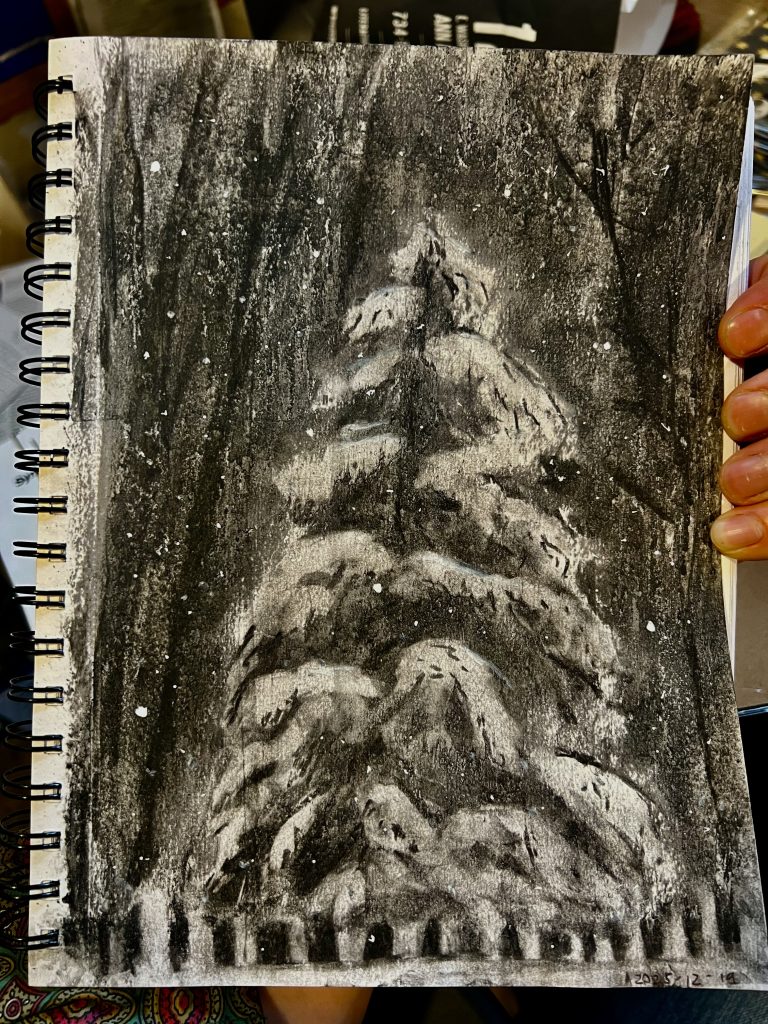
So, on the one hand, a bummer to go to an architectural gem and not be able to see it. On the other, I really loved seeing Fallingwater in situ in person (context: my father was trained as an architect, my mother as a painter and lithographer; I grew up with a lot of art and in a lot of museums and a lot of opinions about architecture and design and construction ad nauseam). I especially loved the tension between this balanced, monumental, (in)famous building and this towering unnamed pine tree.

I spent the next week drawing it, compositing my photo and several existing professional shots of the building, so I could have untented Fallingwater in its place among the trees, scaled as I saw it at the end of December 2025. The results were five sketches: Fallingwater (i–v). My wife and kids were divided and which attempt came out best.

My son insisted it was Fallingwater (iii) (he couldn’t say why, but I think it’s because he was standing with me when I took the above pic, and liked how this sketch captures both cataracts and the pool between):

A pencil sketch of Frank Lloyd Write's Fallingwater

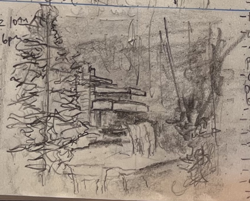
I preferred (iv), because it felt like I got the depth on the rocky outcropping right, and there was some stuff with line weight that worked out:

A pencil sketch of Frank Lloyd Write's Fallingwater

And my wife and daughter chose (v), with my daughter specifically liking that you could glimpse the windows and underpinning structure better:

A pencil sketch of Frank Lloyd Write's Fallingwater

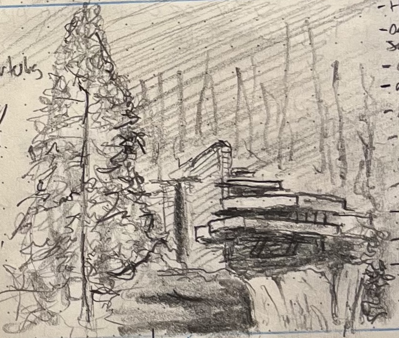
In retrospect, I agree with my wife and daughter: Fallingwater (v) is best, but mostly because it makes the tree and the building equal protagonists in the scene. Also, the rocky outcropping is pretty good.

Tree, Snow, Charcoal (Sketch of the Week for Week 50 of 2025)

A charcoal sketch of a bare, snowy tree. Snow falls in the gloom.

I wasn’t super happy with this one (but much less happy with everything in my journal; I’ve spent the last couple weeks trying to learn to quickly capture facial expressions, and now feel more face-blind than when I began).

My son opined that my dissatisfaction with this charcoal arose from the fact that a deciduous tree has harder lines and holds snow differently than a pine, and thus doesn’t lend itself to the sort of gauzy effect I got in Week 49. I think I maybe just lucked out last week and ended up punching well above my weight. I did like the way further mixing media (adding in white gel pain overtop the Mod Podge that’s overtop the soft charcoal) made the snow pop the way I like.

Anyway, it’s still winter here, so expect further snowy trees in your future.

Prudenville, MI, Thanksgiving, Snow (Sketch of the Week for Week 49 of 2025)

I was up in Prudenville, MI, visiting my in-laws for Thanksgiving and took some pictures. It had snowed before we arrived, and then snowed much more overnight. There was a fair bit of digging out to do so we could get our early start to get our son to his bus so he could travel 11 hours back up to Michigan Tech for finals, and then take another 11-hour bus home again within a couple weeks.

This is my fourth charcoal sketch, working with that same old and forgiving willow charcoal. A nice thing about willow charcoal is that it erases damn near completely. This is great for me, because it lets me build up a tree “logically”: I can rough in the tree, then start erasing back down to white paper for the snow while deepening the blacks with more charcoal for the deeper shadows.

The tricky bit is that willow charcoal is so soft and forgiving that it is damn near ephemeral. If you want the sketch to stop changing, you have to seal it. I don’t own any fixative, so instead I cut old Mod Podge with a little water and spray it in sloppy puddles over the drawing, than squeegee it with an old plastic gift card or credit card or whatever. This lowers the contrast, bringing down my whites and blending in my darks (which is a bummer), but it imparts a streaky surface finish I really, really, really like. Also, it’s fun to have this whole other dimension along which to experiment with the drawing once the drawing is done: changing the thicknesses of the application, adding more layers, squeegeeing in different directions, etc.


FUN FACT: Prudenville, MI is the setting for most of what’s in this essay from 2014 or 2015.

Just a city tree (Sketch of the Week for Week 46 of 2025)

I can never decide if these little guys are extremely sad, or sort of inspiring. They’re stunted and twisted by their constraints, but also tenacious despite insurmountable concrete limitations.

Pencil sketch of a little city tree next to a planter and a parking sign

If you’re looking at this, you’re almost by definition just a twisty little city tree like me. And, now that I think about it, probably that tree—which I’ve regularly walked past for maybe 30 years now—doesn’t have too high an opinion of me: I could literally go anywhere in the world, and haven’t gotten any farther than he has.

What a fucking judgy-ass tree, amirght? Fuck him.

Tree and Bench [NOT PICTURED: all of humanity] (Sketch of the Week for Week 40 of 2025)

Week 40 was “Tree Week” in my journal, where I worked on capturing more different kinds of trees under different lighting conditions. It didn’t go superterrific, but my son liked this one because the overall composition communicated the scale nicely, and it captured something of the late-day autumn light in Michigan, which has an oddly specific angle and saturation.

A pencil sketch of a tree near a bench and pathway, caught in the deep slanting light of late-day Michigan autumn.

I’m sharing it not because it’s especially good, but just because it puts me in the mind of Edward Hopper, who I think captured the unique (and uniquely enduring) dimensions of American Loneliness better than any other artist who has yet lived.

In the pines, in the pines, where the sun don’t never shine ♬♫♪ (Sketch of the Week for Week 29 of 2025)

My wife and I spent last week canoeing in the backcountry along the Minnesotan-Canada border in Voyageurs National Park, which is noted as being among the nation’s least visited parks—an extremely attractive feature if, like me, your favorite quality of the National Park system is the opportunities it presents for spending a week never getting closer than several hundred feet to a stranger (and that only across a body of leech infested water).

Along with solitude and no cell coverage, this trip afforded an opportunity to work on landscapes and natural still life, both of which I’ve largely neglected recently (I spent my sketching time over the last very hectic month focusing on timed gesture exercises).

Here’s my son’s pick for the Sketch of the Week. He especially liked the “gesture of the shoreline,” and the rendering of light and shadow in the pines and on the water along the shore:

A pencil sketch of the pine-crowded shoreline of Loiten Lake in Voyageurs National Park

This was the far shore across from our campsite on Loiten Lake, which was the furthest back we went on our trip (the second day, during which we canoed across three lakes and did three portages, schlepping indestructible aluminum National Park canoes through ankle-deep mud, mosquito-blessed pine forest, and over rocky hills).

That treeline was lovely, because of how it changed with every moment of the shifting light. It brought to mind my favorite Impressionist work, which wasn’t even a work, but rather an exercise in self-torture: Claude Monet’s Rouen Cathedral series. I don’t really like Impressionism, or Europe, or Frenchmen, or Cathedrals, but I’ve loved those painted sketches since I first saw them in college, at maybe 18-years-old, because I love what they say about shadow and light—all of which is to say that I may dislike Impressionists, but I’m deeply touched by what they are grappling with, and eager to grapple with it as well (albeit on my terms, you cheese eating surrender monkeys!)

BONUS: The title of this blog post is a reference to this traditional tune: