I was up in Prudenville, MI, visiting my in-laws for Thanksgiving and took some pictures. It had snowed before we arrived, and then snowed much more overnight. There was a fair bit of digging out to do so we could get our early start to get our son to his bus so he could travel 11 hours back up to Michigan Tech for finals, and then take another 11-hour bus home again within a couple weeks.
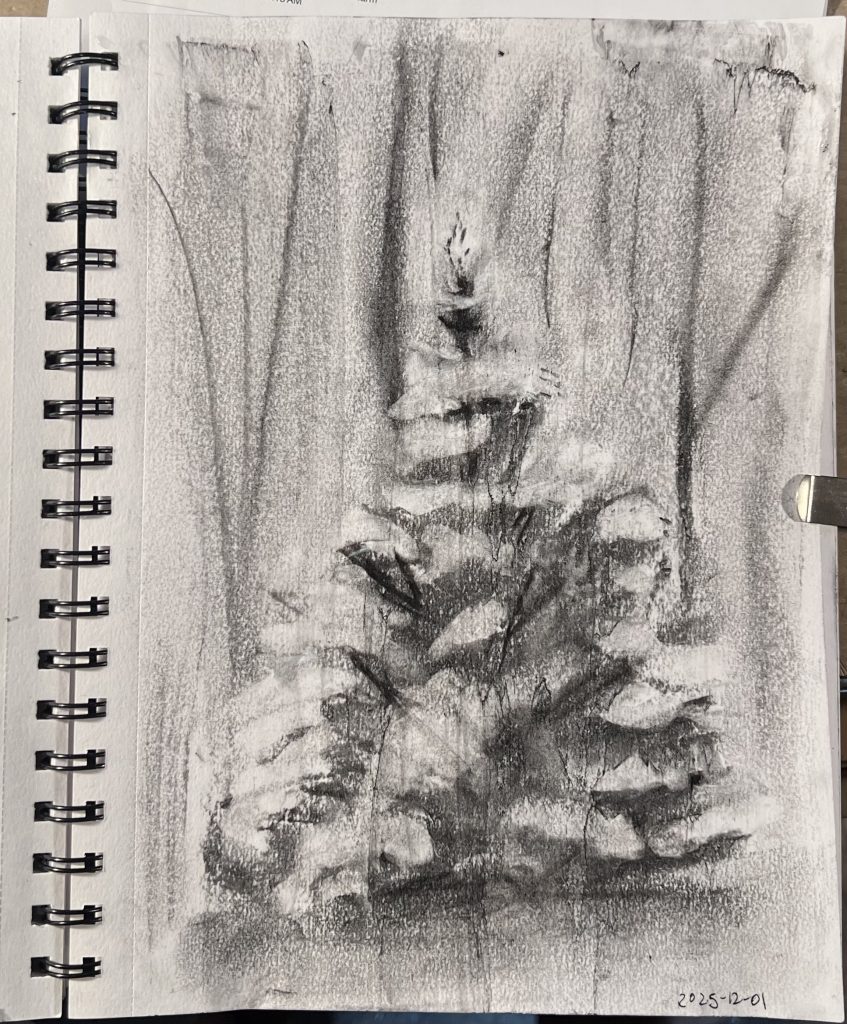
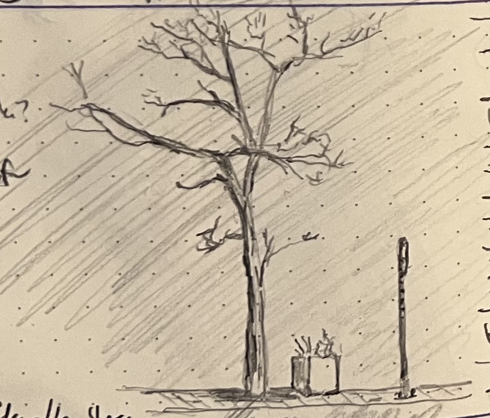
This is my fourth charcoal sketch, working with that same old and forgiving willow charcoal. A nice thing about willow charcoal is that it erases damn near completely. This is great for me, because it lets me build up a tree “logically”: I can rough in the tree, then start erasing back down to white paper for the snow while deepening the blacks with more charcoal for the deeper shadows.
The tricky bit is that willow charcoal is so soft and forgiving that it is damn near ephemeral. If you want the sketch to stop changing, you have to seal it. I don’t own any fixative, so instead I cut old Mod Podge with a little water and spray it in sloppy puddles over the drawing, than squeegee it with an old plastic gift card or credit card or whatever. This lowers the contrast, bringing down my whites and blending in my darks (which is a bummer), but it imparts a streaky surface finish I really, really, really like. Also, it’s fun to have this whole other dimension along which to experiment with the drawing once the drawing is done: changing the thicknesses of the application, adding more layers, squeegeeing in different directions, etc.
FUN FACT: Prudenville, MI is the setting for most of what’s in this essay from 2014 or 2015.