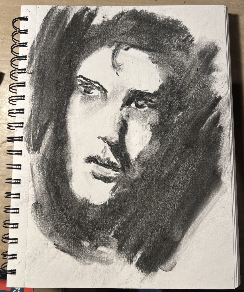
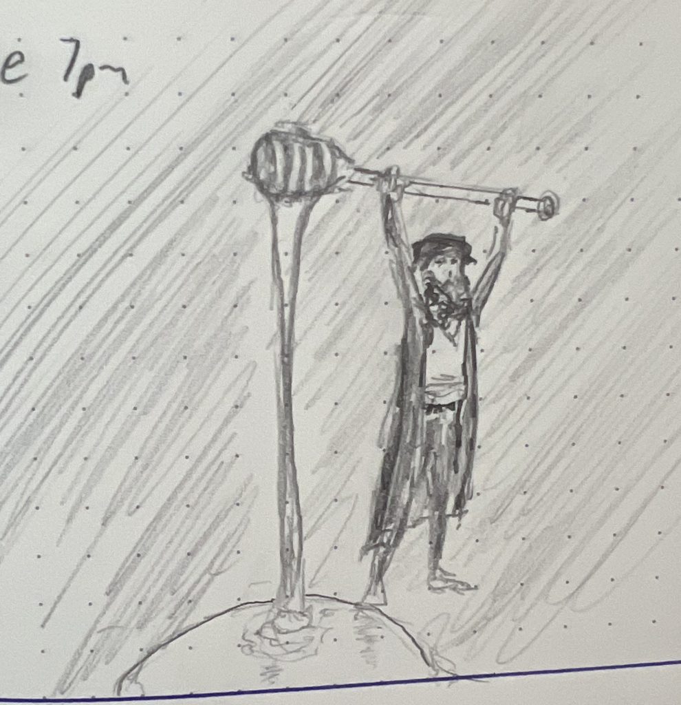
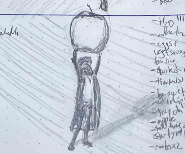
My son is into D&D and Magic and martial arts, so he sorta loved all of the sketches from this past week, which was all fantasy topics. He thought “Cloaked” was the standout, because the shadows gave it the best depth:
He also liked the rightsized detailing on the “Herald of the Odd God” and the gesture of the man she struck down:
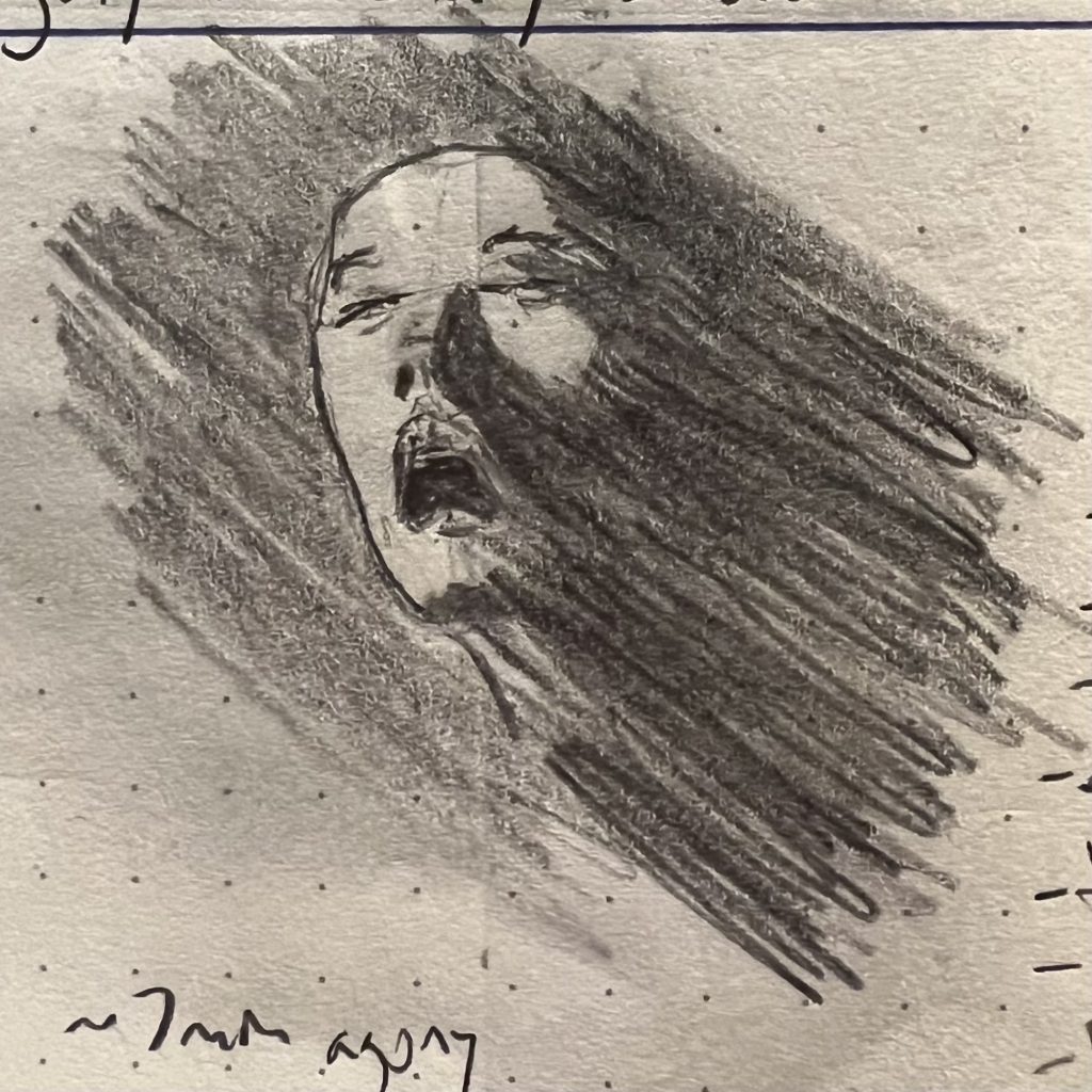
I also liked how this shaman wailing for her demon lover came out. The technique isn’t great—she almost drifts into Ninja Turtle territory, for godsake—but it’s really legible: It catches the eye from a distance, is easy to immediately read, and worth giving a second look. Honestly, should I really be asking for more? It’s sorta like last week’s deep sea diver: a reminder that composition and technique and artistry aren’t the goal on their own, but at the service of catching someone’s eye and making it worth looking twice.
I’ve been thinking more and more about shade and tone and value, and how much more important to form these are than line is. I have pretty crummy distance vision, so just taking off my glass is a quick reminder: most of the time, I mostly cannot see lines at any meaningful distance. Instead, my brain intuits form by assessing tonal values.
So, the big project right now is turning that whole processing system off in my head, so the hand can just draw the layers of darkness the eye sees, without the stupid brain telling me what’s round and where a corner comes together at 90 degrees. Yeah, that lip is round in real life, but it is flat on paper and just grading from deep black to untouched; that beam’s corner where it meats the joist is 90º on my porch, but is waaaaaay closer to 140º on the paper; the same shadow is way darker on the interior face of the beam than it is on the side.
Anyway, my son opined that “Bit Lip” was the best sketch of the week, so I’m posting that here:
But I think I was more pleased with “Porch Detail”; I’ve struggled mightily to “unsee” 90º angles in architecture, and I think I finally got there on this sketch.
That said, my boy is right: the lips are a more compelling picture overall, even if technically rougher.
Meanwhile, I’m tossing this guy in as a bonus, because he’s proven sort of a mystery: it’s a failed sketch, to me, totally missing what I was trying to capture, and pretty technically sloppy. But everyone who glances him in my journal asks about him. There’s something about him that is speaking to people along a wavelength I cannot detect. 🤷♀️
My son and I once again were of differing opinions. I thought the best sketch from last week was this one:
He agreed that it was good technique overall, and he liked the gesture. But nonetheless, he thought this one was the best sketch of the week:
I argued that nailing the foreshortening put this over the top, even if it is overall looser and more dashed off. No doubt, foreshortening is devilishly hard: You sort of have to turn off your brain entirely and just let your eye thoughtlessly control your hand to even get remotely close to getting it right. As such, even if the “technique,” broadly speaking, is better in the top sketch, it’s also true that the top sketch is very much an analytical exercise, one where I spent a lot of time layering up graphite in order to make this posture legible at a glance. As such, I didn’t just think about it; I vastly overthought about it, arguing with myself, breaking down what shapes were where and why. Meanwhile, my “technique” was fundamentally stronger with the bottom sketch, in that it was drawn with almost no intellectual engagement or justification or analysis, just my eye guiding my hand, setting down what it saw. Simple recording, without analysis, is at the heart of the exercise.
I dunno. I still feel “Defeat” is the better sketch—or, at least, it captures the current moment better, and that’s what it’s all about.
Folks often complain about drawing hands—hands are hard! And they are 100% right: Hands are hard to draw. The one unalloyed good that has come from the advent of generative AI is that it’s objectively confirmed that hands are really hard to get right: we used supercomputers to capture, encode, digest, and average all human art ever, and even it consistently fucks up the hands. That is some poignant shit right there.
But hands are sort of awesome models. I’ve probably drawn more left hands than anything else in my life, because I’m right handed, which means there is one model I always have with me that can adopt as wide a range of poses as the entire human body. If you want to sketch and improve at sketching, your hand is an amazing model.
Anyway, even with decades of drawing hands, they’re still hard. A lot went wrong with this sketch as I worked it, but it ended up in the right place: it captures, to my satisfaction, something ineffable I was feeling about the human condition, and it does so in three square inches of pressed wood pulp and graphite, in a way that you can either grasp or ignore at a single glance.
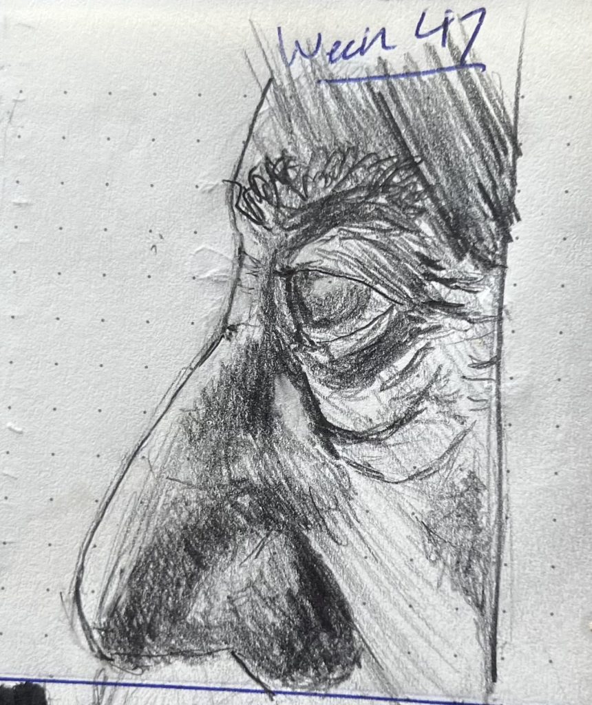
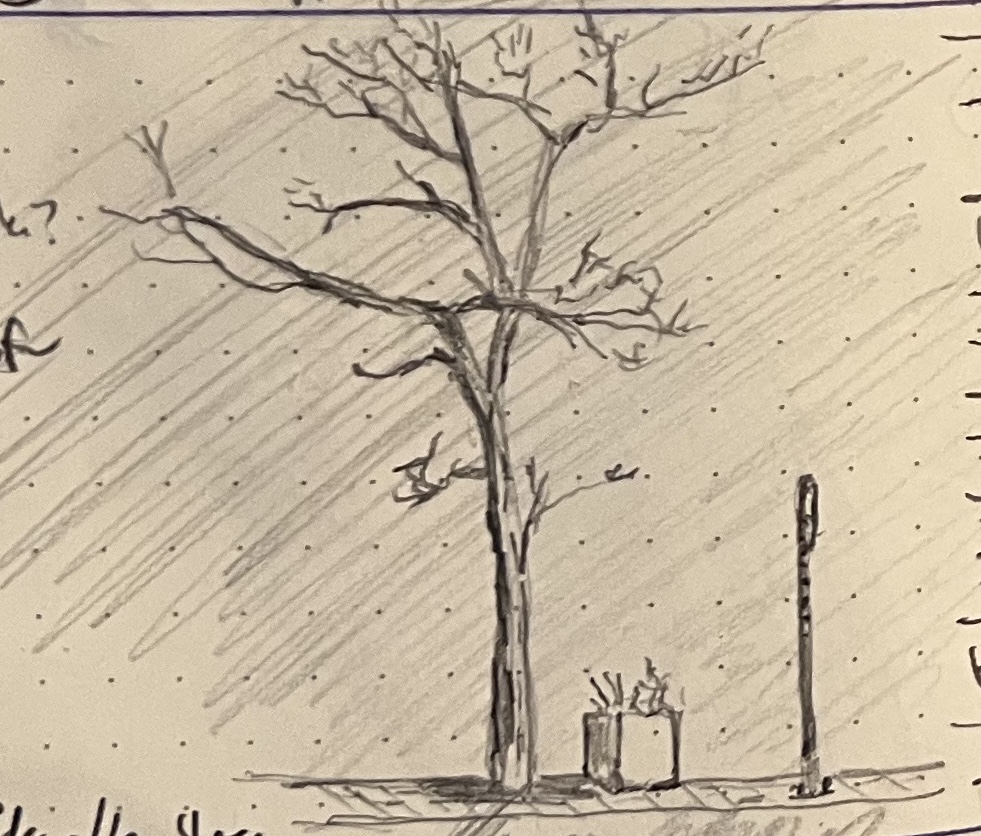
Another week where Sketch of the Week was disputed; my son felt strongly that the lower sketch of the sunrise through a just-budding cherry tree, was the stronger work technically, in that it captured something about the way light behaves in that situation that he found delicious. I preferred the windswept old man, because of the way he teeters between sinister and good-humored in the same why the open eye from Week 14 vacillates between terrified and enraged.
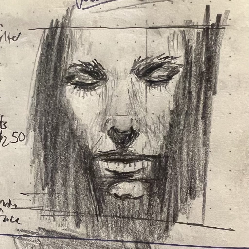
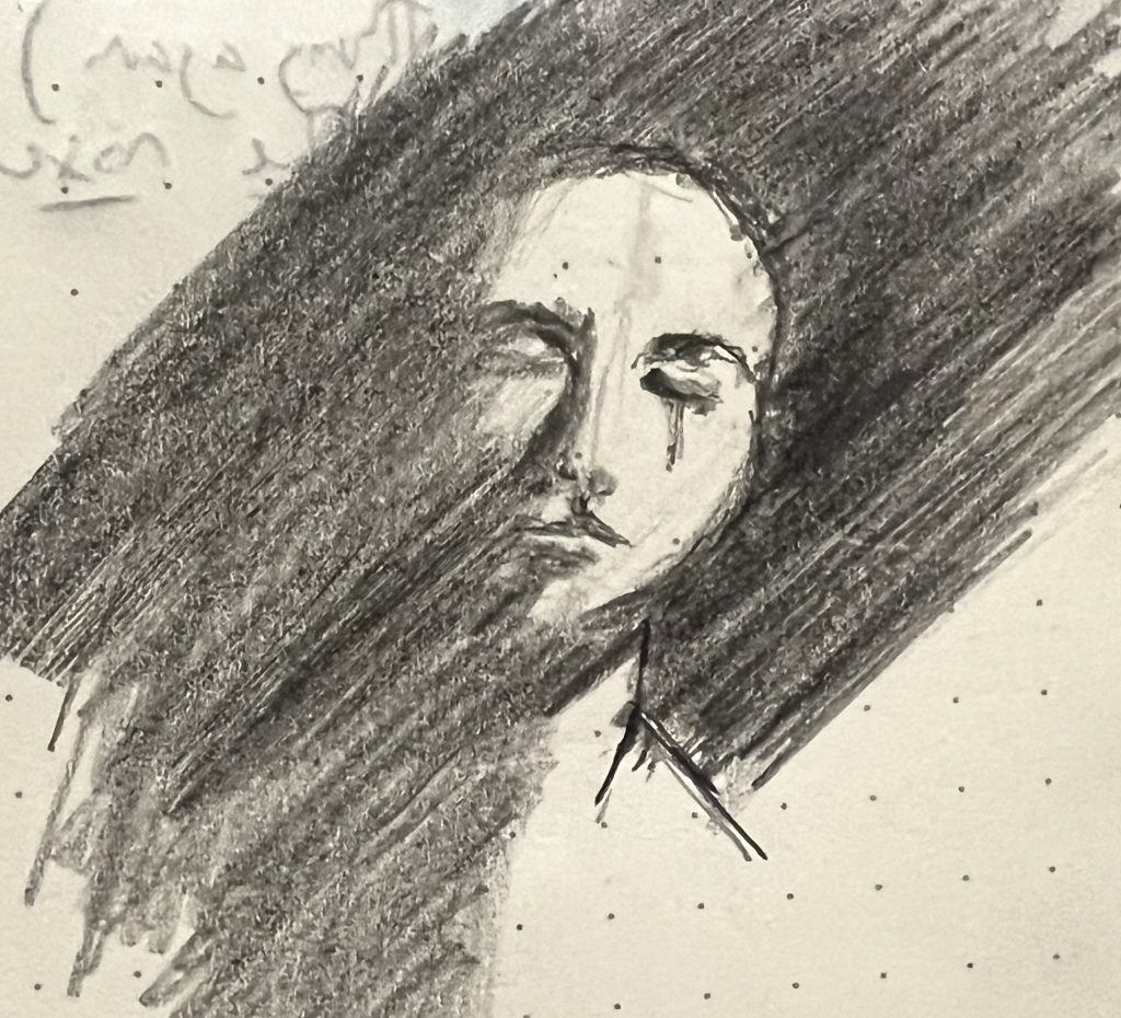
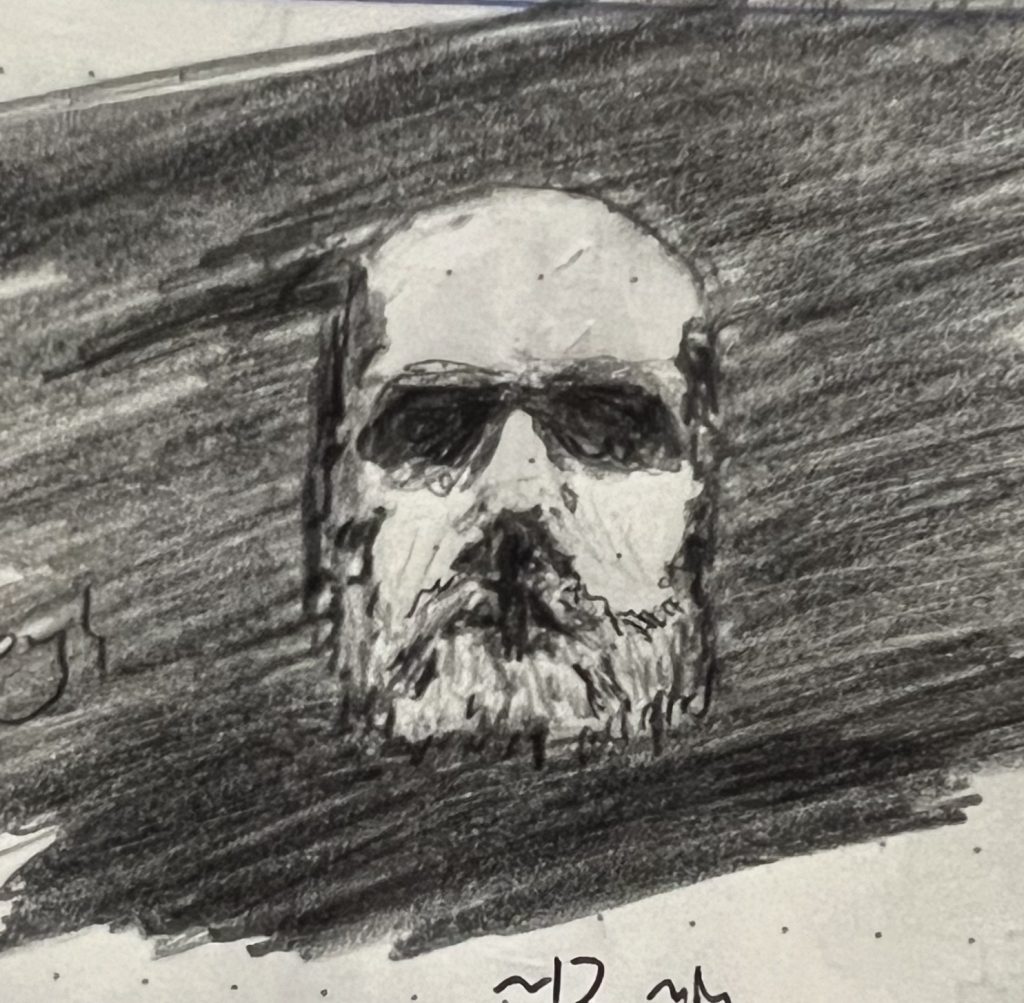
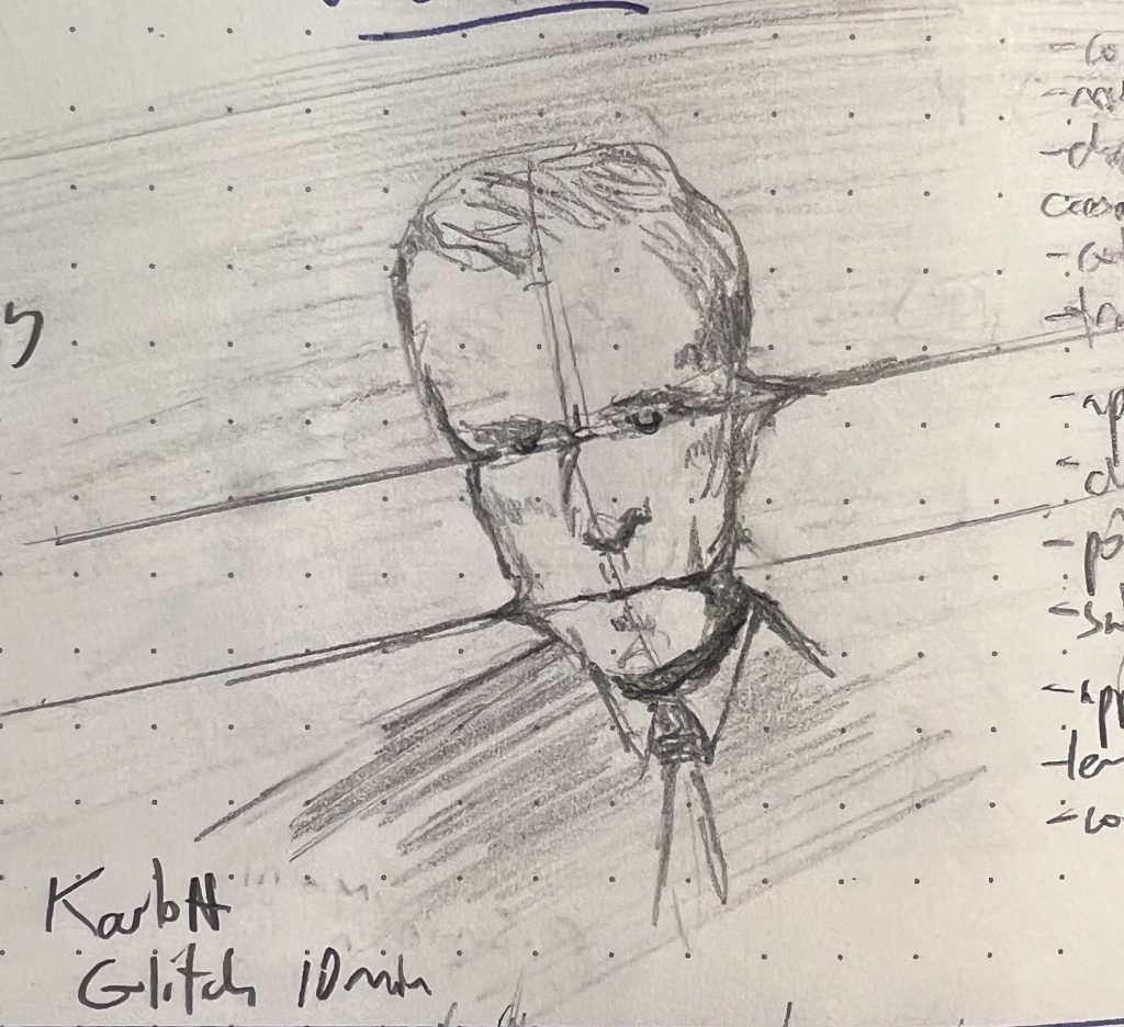
Last week I started thinking about how facial features are inherently disturbing when they are looming out of the gloom or otherwise decontextualized. Hence these sketches.
I was especially pleased with the eye, and how from moment to moment you can’t quite land on whether it is terrified or enraged. I’m inclined to think “both,” that there is a situation in the dark where you are peeling open your eye—or someone is doing it for you—and you yourself cannot reliably determine if you feel terrified or enraged, or both and in what proportions. If I were to title that sketch as a standalone piece of art, it would be “Reading the Newspaper at the End of the Day in 2025.”
All of this was inspired by this sculpture by Hirotoshi Ito:
Feel free to google him. There’s more Ito where that come from.
Sorry again for the long break; I was sick, and then I was at a conference in Florida, and then I was on vacation in Michigan’s UP, and now I’m back.
My son was emphatic that this was the sketch of the week, because he liked the composition and the implied narrative and the fact that there was dialogue:
I’m not so sure. From a technical standpoint, I think this sketch of a single stone on a Lake Superior beach just outside Porcupine Mountain Wilderness Area is the better sketch:
I have the grit on the sand all wrong (I got sloppy, and the technique was no good to begin with) but I feel like I got the depth of the shadow right for maybe the first time ever.
Anyway, it’s not really my call which is “best”; that’s for you. I get what I get out of them in the drawing, and in sharing them with my son.
I didn’t post a sketch last week because 1) I was absurdly sick with influenza A and 2) wasn’t really happy with anything I drew that week. I’m less sick this week, and more satisfied with my work. My son voted for this sketch:
The reference image here is a sample from a reference image pack I found online. I originally took a run at it specifically because I figured it would be basically impossible for me to capture: the cloth’s draping was so complex, and my eyes really had trouble following it. I couldn’t conceive of how I’d communicate a figure I could hardly see.
In the end, this was a super revealing exercise for me: having all those familiar landmarks (eyes, ears, shoulders, hips) gone forced me to simply do the thing I’m always trying to do, and failing at: to look at the subject and draw what I’m seeing, and the feeling of seeing it, not my ideas of what a woman (or whatever) looks like, and what it takes to show one to someone on paper.
I’d thought it would be maddeningly frustrating, but it ended up being super relaxing. 🤷♀️
My son insisted that every sketch from last week had a claim on Sketch of the Week. While I wouldn’t go as far as him, I’m not gonna lie: I was really pleased with this batch, esp. Monday (“Warrior”), Thursday (“Shadow Dancer”), and Friday (“The Terror of Jim Carrey”)
Monday: “Warrior”—This is based on a photo I found on Pinterest, a platform that I’m embarrassed to admit I’m really liking, as it’s proving to be a really good source of reference images. I love the strength of that pose! There’s a lot I failed to capture here—the original model is quite muscular, while mine is almost gaunt; the original pose has this nearly bone crushing hauteur, and mine is almost contemplative—but I was really pleased with the strength in her stance, and I captured that. She feels unmovable, like a dolmen. This is definitely the best all around drawing from the week, according to my son, who really liked the values and shadow shading.
Tuesday: “Swordsman”—Another Pinterest find. My son really loved the dynamism of the pose and the economic capturing of the back muscles. I went after it because I found the pose both interesting, but challenging to make legible.
Wednesday: “The Ahmeek Stamp Mill Ruins”—This is a real place near where my son goes to university. The reference was a photo I took when we were visiting him a couple weeks back, and the ruins were buried in about four feet of snow. He really loved the subject matter, and thought I captured it well. I disagree, but it’s such a mind-bendingly weird place, I’m pleased I did as well as I did. I’m planning to take another stab at it in a larger format, and hopefully with watercolor.
Thursday: “Shadow Dancer”—A benefit of Pinterest is that it’s sent me in new directions looking for reference photos. It had not dawned on my before to look for dancers, but Pinterest is full of photos of them from all sorts of sources, and dancers strike some incredible and gnarly poses; such great monster and eldritch being fodder! This one is more abstract and less eldritch, but I loved what her shadow was doing on the wall.
Friday: “The Terror of Jim Carrey”—I modeled this off of a relatively famous set of pics of Jim Carrey. It’s not a good drawing of Jim Carrey, and it isn’t even really a good drawing of the actual gesture he’s making, which is a sort of mugging cartoonish surprise. But jesus!, what I got on the page was arresting; it captures legitimate terror for me in a way I’m having trouble articulating. I find that tiny scribble so goddamned disturbing, I’m fascinated.
We had a long weekend last week, and so drove up to visit my son at college and do some cross-country skiing. He goes to Michigan Tech University, which is in Houghton, in Michigan’s Upper Peninsula. It’s not just in the Upper Peninsula; it’s in the Keweenaw Peninsula, which is the northern most bit of this northern most bit of Michigan. Most folks have no idea how absurdly far from basically anything this is, and how off the beaten path basically the entire UP is. It’s a 10 to 12 hour drive from our house to his dorm. You can drive to Washington, DC quicker. Houghton is north of the 45th parallel and west of Chicago. Everyone there are Packers fans and, despite it being the birthplace of pro hockey, you basically so no Red Wings gear. It’s all pine trees, and they still have logging there. The mountains in the UP are some of the oldest in the world, clocking in at 2 billion years–making them older than the idea of trees. My kid goes from class to class kitted out like he’s in Mad Max: Beyond Snow Globe—not because he’s got an innate sartorial flare, but just as a practical matter. It’s not just absurd that this is part of Michigan; it feels sort of absurd that it’s part of this timestream.
As near as I can tell, the Keweenaw has been in a state of “Winter Weather Advisory” since late November. There are feet and feet of snow. It was snowing basically the entire time we were there, mostly sideways. Plows ran at all hours, and people were sort of perpetually shoveling. Once you were out of the town of Houghton (where the college is), it’s clearly a constant battle to keep roads passable and maintain at least one functional entrance to your house.
We were staying in a little town north of Houghton called “Lake Linden.” I have no clue why the town is called that, since the lake that it’s on the edge of is Torch Lake. We rented a Vrbo apartment that was in a brick building built in the late 1800s whose ground floor tenant was an ACE hardware, one of the town’s four or five clearly functional businesses. The Vrbo had 15-foot ceilings with 12-foot-tall windows, slept eight, allowed dogs, and cost us I think around $70 per night. If we’d stayed in Houghton we’d have paid $200 per night for a single room in a Super 8, and couldn’t have had the dogs with us. If we’d staid any further north, I think we’d still be there, forced into cannibalism or binge watching all of Bluey.
This sketch is the detail of the entrance to the neighboring building. It was built around the same time as the building we were in, but was of uncertain status. The side of it said “Dave’s Home Improvement Center” but neither of the two existing store fronts appeared to be going concerns, let alone dedicated to home improvement. One entryway had been renovated, with modern glazing and frames. The other was absolutely ancient painted steel and wood. Some of the brickabrack inside implied that maybe there was occasionally a farmer’s market held there, but none of that had happened recently. There was a ton of cilantro growing in trays, leggy and too tall, collapsing under its own weight.
The architecture in the Keweenaw Peninsula is pretty fascinating and fun to draw, especially in winter: there are a lot of industrial ruins from when this was copper mining country, along with lots of ornate gingerbready buildings from the 1800s. So you’ve got these hard edges and lines and detail work, and then it’s all mounded with these organic masses of visually depthless white snow. It’s pretty beguiling.