Tag: newsD
“So those two trees are the protagonists?” (Sketch of the Week for Week 34 of 2025)
I spent last week hiking Isle Royale with my family, and so it was “landscape week” in my journal. Under normal circumstances, you likely wouldn’t be seeing a “sketch-of-the-week” from me following such an endeavor, because almost all of my attempts at landscape thus far have been horrid. But on the second day of the trip I was sitting on the concrete dock at the Moskey Basin campground with my son. He glanced at my sketch in progress, then up at the subject, and joked “Oh! So those two trees are the protagonists?”
And with that joke it clicked: just as I struggled with figures before I pinned down that I needed to start with a single line capturing the gesture, I was struggling with landscape because I needed to start by determining what element (for me) was the “protagonist” in the scene.
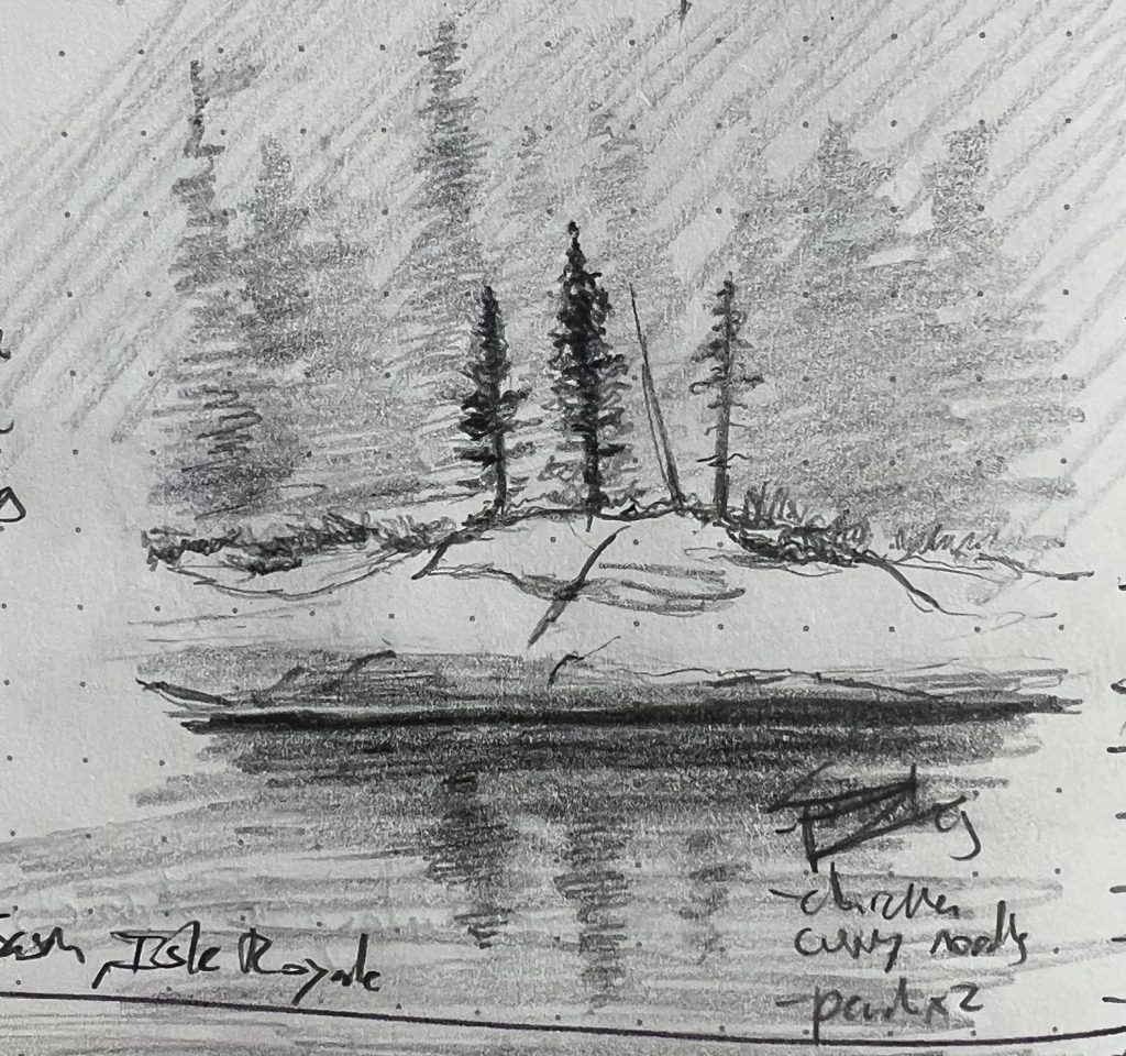
I ended up basically happy with all of the sketches from landscape week, but my son felt that this one of the brave little pines at the very edge of Moskey Basin was the best overall:
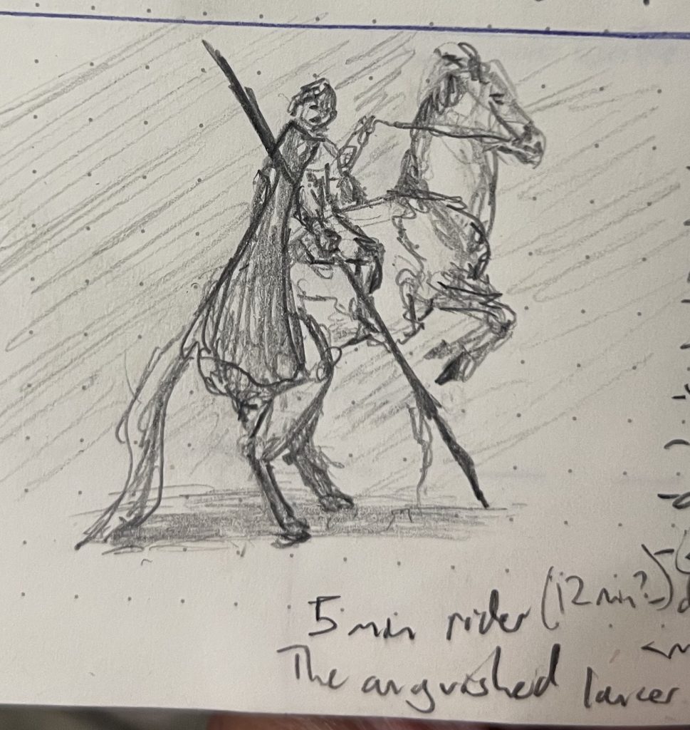
“And I looked, and beheld a pale horse: and his name that sat on him was Death…” (Rev 6:8) (Sketches of the Week for Week 32 of 2025)
Last week was “horse and rider” week in Dave’s journal. Each day was a timed sketch (from 5 to 12 minutes), and I was pretty pleased with all of them. Setting a timer has proven to be a potent tool for helping me know when to take the drawing away.
My son loved all of these, but his favorite was this “anguished lancer”—the shortest sketch of the bunch. What’s on this paper took just five minutes to sketch, after seven minutes spent attempting and adjusting and trying again, only to erase every mark I’d made and start over from scratch. Probably I should categorize this as a 12-minute sketch, as the undrawn horses I erased were as important to the final result as the one I left on the paper.
For my part, I think my favorite was the 12-minute “bronco rider,” which was my son’s second fave. He really liked the shading and line weight, and how these gave the horse weight and volume on the page. I just really liked the horse’s gesture:
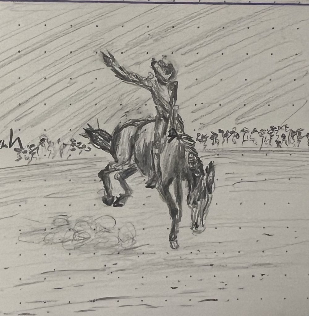
All of the horse sketches were drawn during coffee breaks last week. Twelve minutes is a pretty good amount of time for a coffee break.
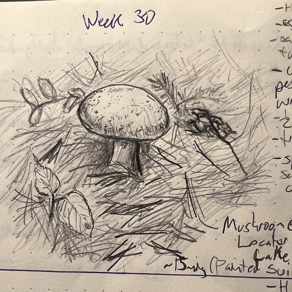
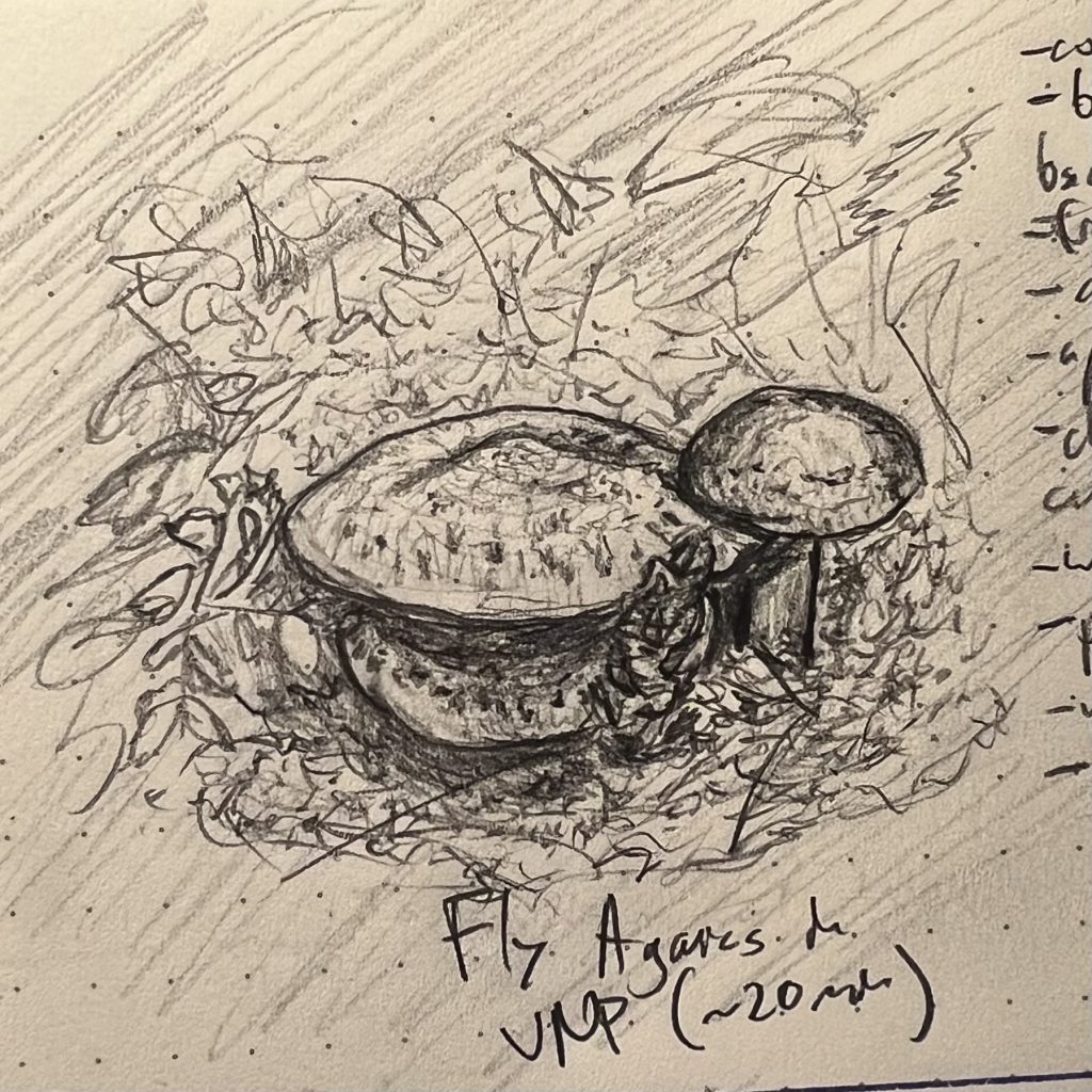
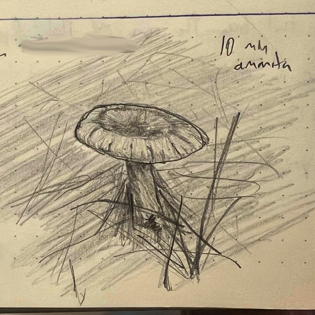
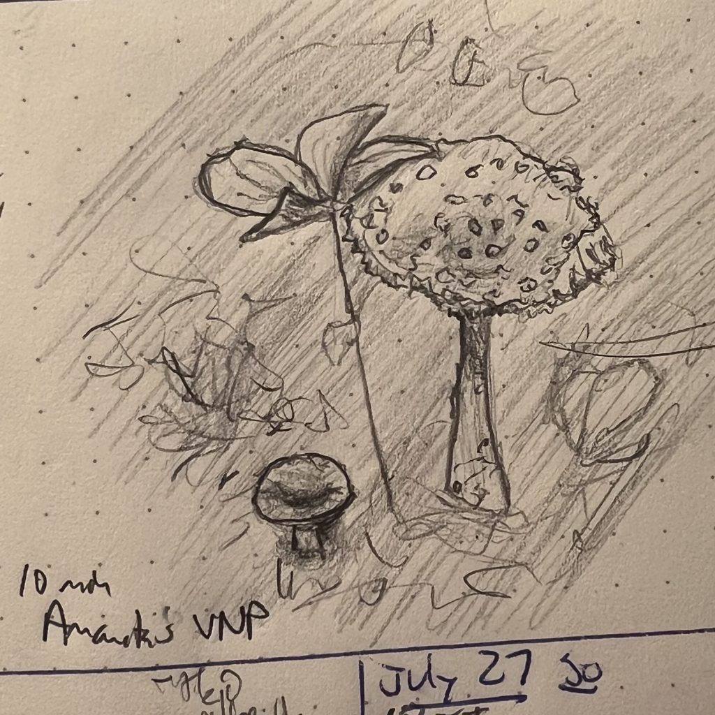
Mushrooms have a lot of character 🍄 🍄🟫 (Sketches of the Week for Week 30 of 2025)
All of last week was Mushroom Week. The first sketch was from life, while canoeing in Voyageur National Park. The rest were from photos I took while hiking there. They’re all either edible painted suillus mushrooms or hallucinogenic amanita muscaria—and a good thing we didn’t need to rely on my identifications, as the grouping in the second sketch is undeniably the edible painted suillus, although I mis-IDed them at the time as amanitas.
Mushrooms are fun to sketch, sort of halfway between people and architecture: they have more gesture than buildings, but more structure than people, with less nit-picky line detail overall. Sort of like sketching a medium-chill, politely attentive cottage, or a fortress tower waiting for its carry-out to be ready.
You’ll note times on these. Something that came out of the no-post weeks of working on gesture drawings and faces was a greater attention to how much time I’m spending, and right sizing that effort, so I can confidently jump into a sketch even when I have a limited block of time to work, knowing I’ll be able to get something satisfactory down. All of these took 10 to 20 minutes.
In the pines, in the pines, where the sun don’t never shine ♬♫♪ (Sketch of the Week for Week 29 of 2025)
My wife and I spent last week canoeing in the backcountry along the Minnesotan-Canada border in Voyageurs National Park, which is noted as being among the nation’s least visited parks—an extremely attractive feature if, like me, your favorite quality of the National Park system is the opportunities it presents for spending a week never getting closer than several hundred feet to a stranger (and that only across a body of leech infested water).
Along with solitude and no cell coverage, this trip afforded an opportunity to work on landscapes and natural still life, both of which I’ve largely neglected recently (I spent my sketching time over the last very hectic month focusing on timed gesture exercises).
Here’s my son’s pick for the Sketch of the Week. He especially liked the “gesture of the shoreline,” and the rendering of light and shadow in the pines and on the water along the shore:
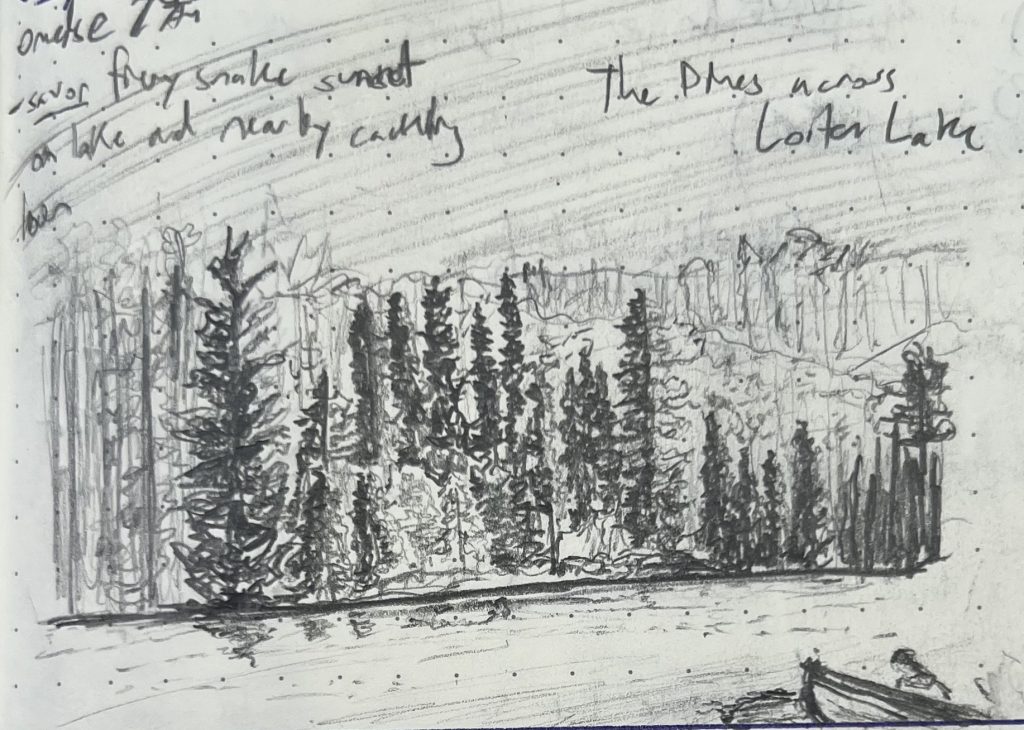
This was the far shore across from our campsite on Loiten Lake, which was the furthest back we went on our trip (the second day, during which we canoed across three lakes and did three portages, schlepping indestructible aluminum National Park canoes through ankle-deep mud, mosquito-blessed pine forest, and over rocky hills).
That treeline was lovely, because of how it changed with every moment of the shifting light. It brought to mind my favorite Impressionist work, which wasn’t even a work, but rather an exercise in self-torture: Claude Monet’s Rouen Cathedral series. I don’t really like Impressionism, or Europe, or Frenchmen, or Cathedrals, but I’ve loved those painted sketches since I first saw them in college, at maybe 18-years-old, because I love what they say about shadow and light—all of which is to say that I may dislike Impressionists, but I’m deeply touched by what they are grappling with, and eager to grapple with it as well (albeit on my terms, you cheese eating surrender monkeys!)
BONUS: The title of this blog post is a reference to this traditional tune:
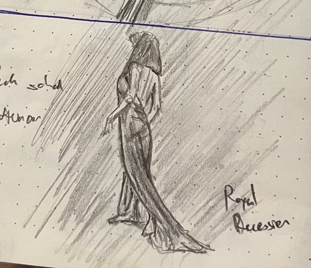
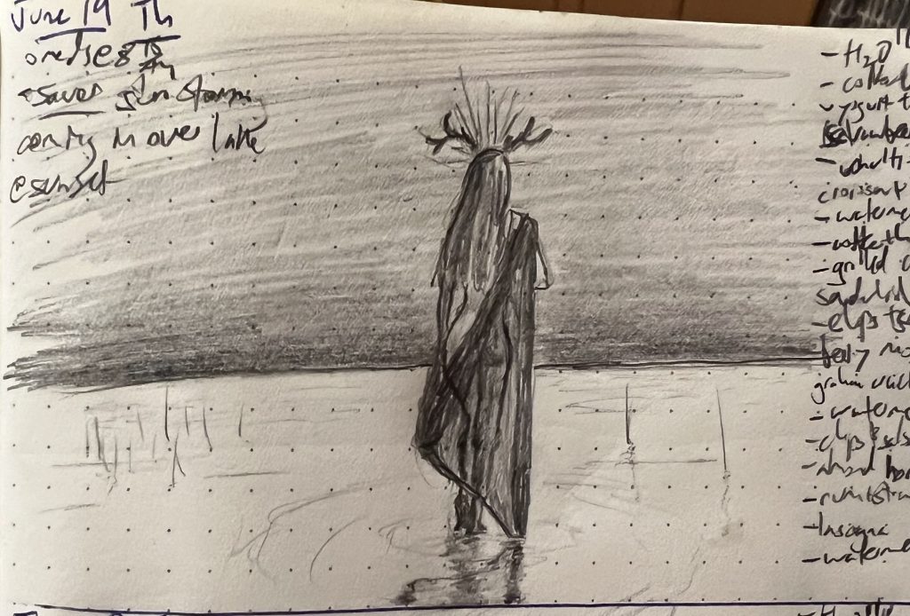
A God and a Bar of Soap (Sketches of the Week for Week 25 of 2025)
My son voted for this god as the sketch of the week, primarily because he really liked how the reflections came out on the water. There’s actually a lot I dislike about this sketch (the major one being that the gesture is wrong: her body is too stuff and vertical, and doesn’t capture the motion I wanted to imply. I wasn’t trying to draw a god idly gazing at the horizon; I wanted to show one treading off to capture it).
But as I’ve said before, powerful naked women are a crowd-pleaser, and so they lead when I’ve got ’em. Besides, I really am pleased with that reflection, and with my first attempt at a diaphanous cloth.
The runner-up is this bar of soap, and probably the better sketch:
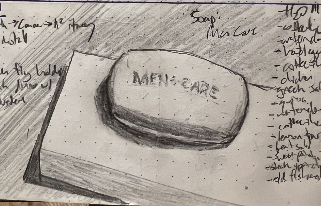
I write for a living, have terrible penmanship, and struggle mightily to “unsee” text as text: when I draw something with a prominent hunk of text in it, it’s devilishly hard for me to draw what that text looks like instead of writing what it says. I’m working on that, and this is the first attempt that got anywhere close to right.
“Don’t hand me no lines and keep your hands to yourself” ♬♫♪ (Sketches of the Week for Week 24 of 2025)
This was another split decision sketch week. I was actually mostly happy with every sketch this week (which is extremely rare) but also felt that each of them had unresolved issues, either with legibility or just minor composition decisions early in the sketch that ended up creating headaches.
At any rate, my son felt that these two were the best showing.
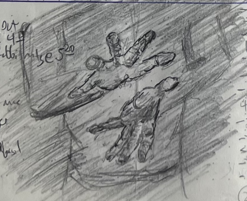
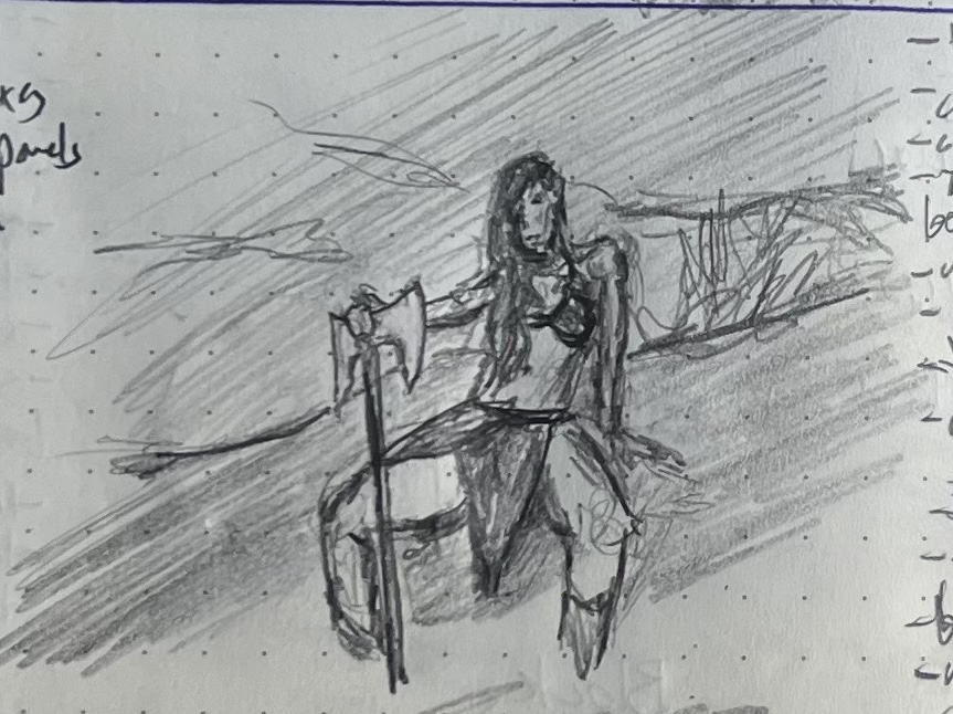
He really liked how the hands loomed out of the gloom, and the overall gesture in the second sketch. I really liked working on the first (the extremely foreshortened hands were both challenging but super engaging to work on) and the second is, as discussed in the past, an indisputable crowd-pleaser (saucy powerful ladies garner second glances and clicks—although, that aside, capturing the depth of the way she is sitting and the angled and occluded way the axe-hand-arm interact was really pleasingly challenging).
Final note: For ladies and gent of a certain age, the title of this post will trigger a potentially catastrophic earworm. To the rest of you, I offer a mostly forgotten one-hit wonder of my Cold War youth, the presumably ironically (???) named Georgia Satellites.
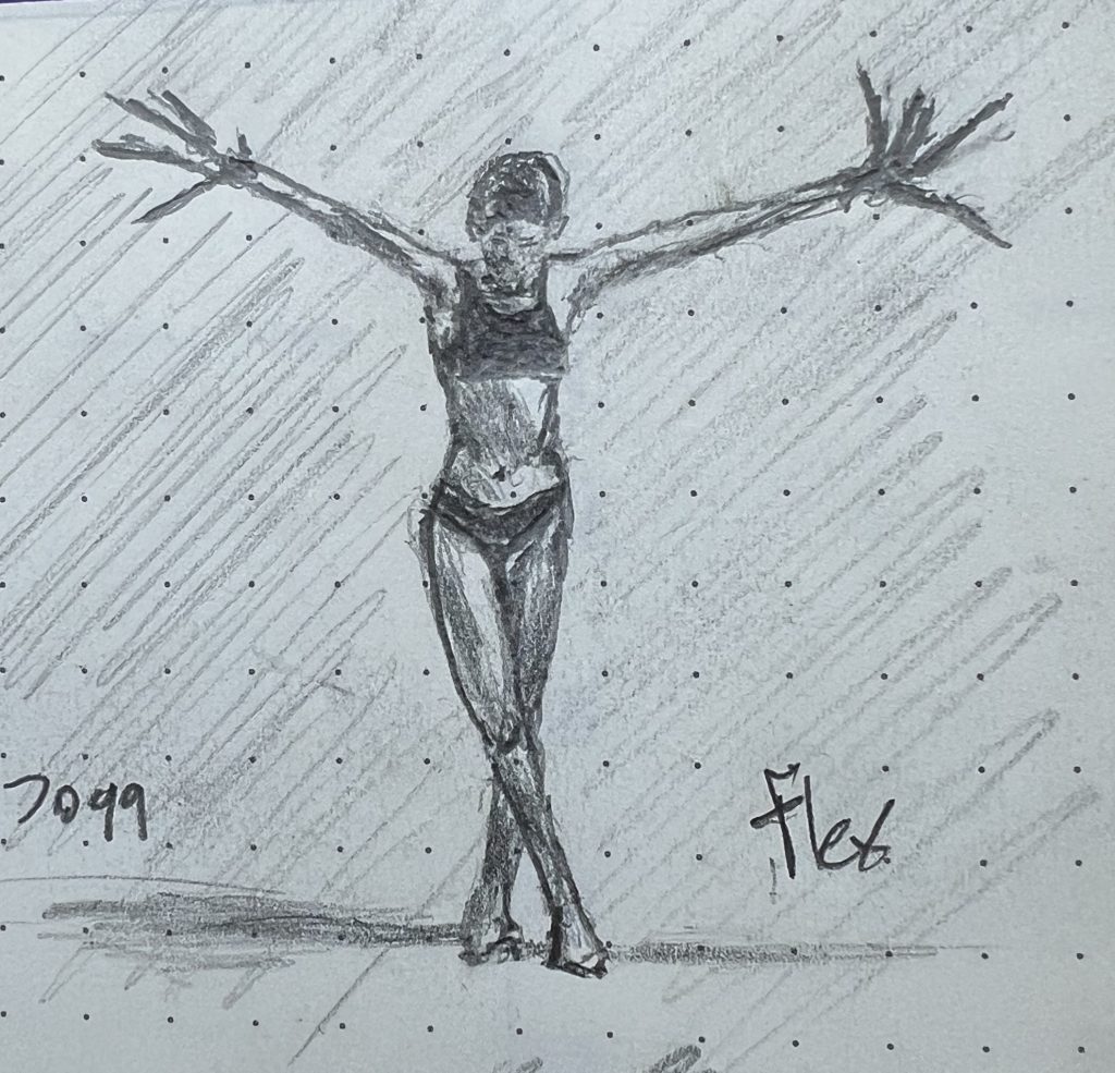
Flex and the Water Bottle (Sketches of the Week for Week 23 of 2025)
This was another week of sketches more about shading and volume than form. My son slightly preferred this first sketch (the model was wearing crazy long-fingered claw-gloves):
But he also really liked this water bottle sketch:
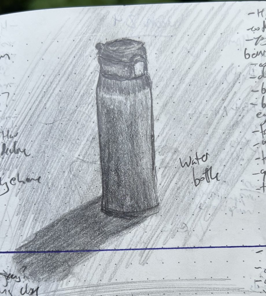
I recognize that the top sketch is more compelling (scantily clad women in powerful poses are a crowd-pleaser!) but the bottle was a bigger victory. The “Flex” sketch was from a two-dimensional image on my phone; I sketch that way a lot, and have gotten accustomed to translating two dimensions of pixels into two dimensions of graphite on wood pulp. The water bottle was just sitting on the table IRL. When you are sharing actual real space and time with an object, it’s much harder to fight the brain’s need to tell stories about what the “actual” shapes are, and instead let the eye tell the hand what it sees where.
Your introduction to the Crypto-Jews of the American Southwest
Some readers are thrown by a reference in my latest story to the protagonist, home inspector and minor-TV celebrity Sadie Espinoza, who describes getting bullied in high school, noting that:
Jewish Espinozas weren’t remotely “wetbacks.” They weren’t even “immigrants”: they’d been in New Mexico—where her dad and his brother grew up—since before it was “New Mexico.” The only thing calling her “wetback” did was make it clear how stupid those girls were, like a house cat strutting around thinking it caught a snake when all it had was a shitty old lizard tail.
Some folks are confused because they had an American public school primary education east of the Mississippi (as I did), and thus don’t know that Santa Fe is the oldest state capitol in the US, having been establish 150 years before the country was founded.
A much greater portion of readers are confused because they think of all Jews as European shtetl folk who came here in the late 19th and early 20th C (as mine did), and thus know nothing about the extremely long history of Jews in the New World (short version: we’ve always been here, and you’ve never liked us).
Anyway, if you’re curious about any of this, the graphic novel El Illuminado is a good introduction to Crypto-Jews and the impact the Inquisition had on world Jewry. Maybe more importantly, it’s really fair in how it illustrates the divisions and discomforts within and among Jews of different traditions/colors/descents, as well as the way that even established, assimilated, respected, modern, “White” Jews often find themselves alienated no matter where they try to stand or sit.
Knowing when to take the drawing away (Sketch of the Week for Week 21 of 2025)
My son was extremely emphatic that this was the sketch of the week, despite it being a week of many good sketches for me:
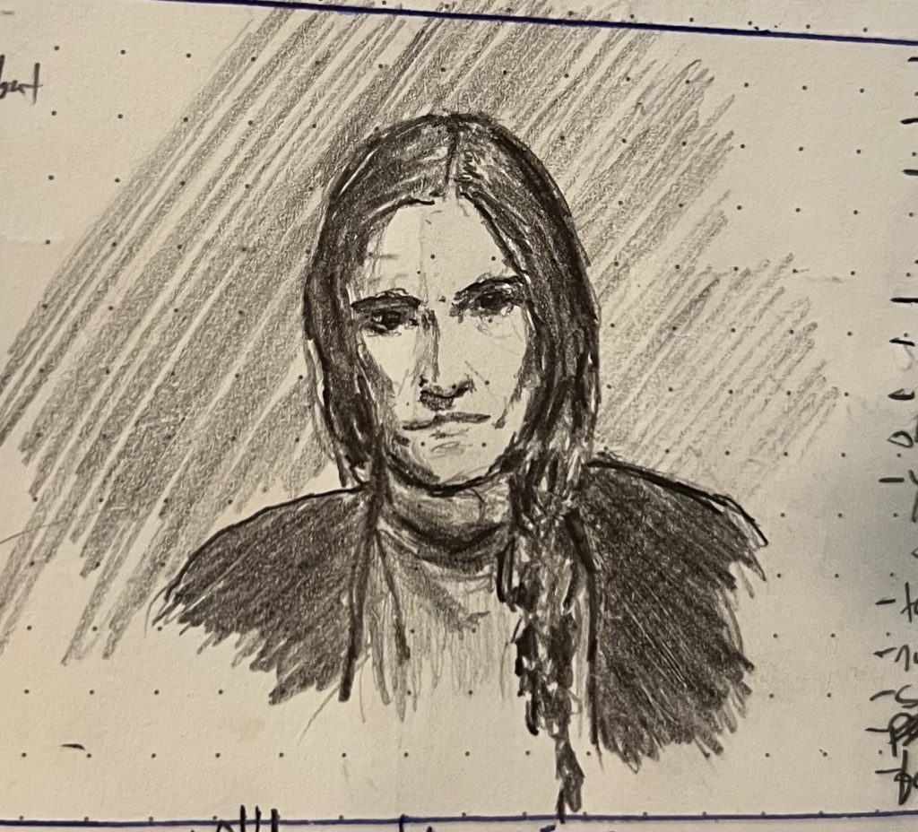
The reference is another still from a horror movie (frustratingly, I cannot recall what film; I think it was a short indie film, but can’t even—Oy! I just remembered! It’s The Blue Drum!) The film wasn’t much to shout about, in terms of story, but I liked it visually; it was understated and made good use of light and framing.
At any rate, my son really liked the shadows and shading and the way that (with his help) I captured how piercing the actress’ eyes are in the particular still frame. As we chatted, it seemed to me what he liked about this sketch was the restraint: it put on the page what needed to be there to capture the mood and her strength, and left off the page what wasn’t part of that. Thinking this one over—and continuing to sketch this week—I was reminded of a bit in John Guare’s play Six Degrees of Separation. If you’ve never read it or seen it, the film with Will Smith is a very faithful adaptation, and worth your time. There’s also an audio drama (or maybe a stage recording?) of it floating around out there, with Alan Alda as Flan, which is great.
At any rate, there’s a point where Flan—an art dealer and collector, passionate about art but no artists himself—recalls his kids having this amazing art teacher in grade school:
                FLAN
          Why are all your students geniuses in the second
          grade? Look at the first grade. Blotches of
          green and black. Look at third grade.
          Camouflage. But the second grade --your grade.
          Matisses everyone. You've made my child a
          Matisse. Let me study with you. Let me into
          the second grade! What is your secret?

                         THE TEACHER
          Secret? I don't have any secret. I just know
          when to take their drawings away from them.
So, that’s what I guess I’m trying to learn now: when to take my drawings away from myself.
As an aside, if I’d been left to my own devices to pick a sketch of the week, I would have chosen this one. Yes, it’s also one that I took away from myself at the rate time (or nearly so), but that isn’t why I’d pick it. I like it because it felt the best working on it, flowed the most naturally and painlessly from pencil to paper. That’s no measure of art or craft, but it left me inordinately fond of this sketvh, because I so enjoyed the process of becoming with it: